Hey welcome to ArtSchool!
Just as a heads up, Marc has said that he is pretty crazy busy and tends to not be on the forums all that much yet, he has said that he intends to be on much more when the classes are all finished. Post your work up for the facebook stream on Saturdays and Marc will give you direct feedback. That being said, there are a bunch of people on the forums that are always happy to help out.
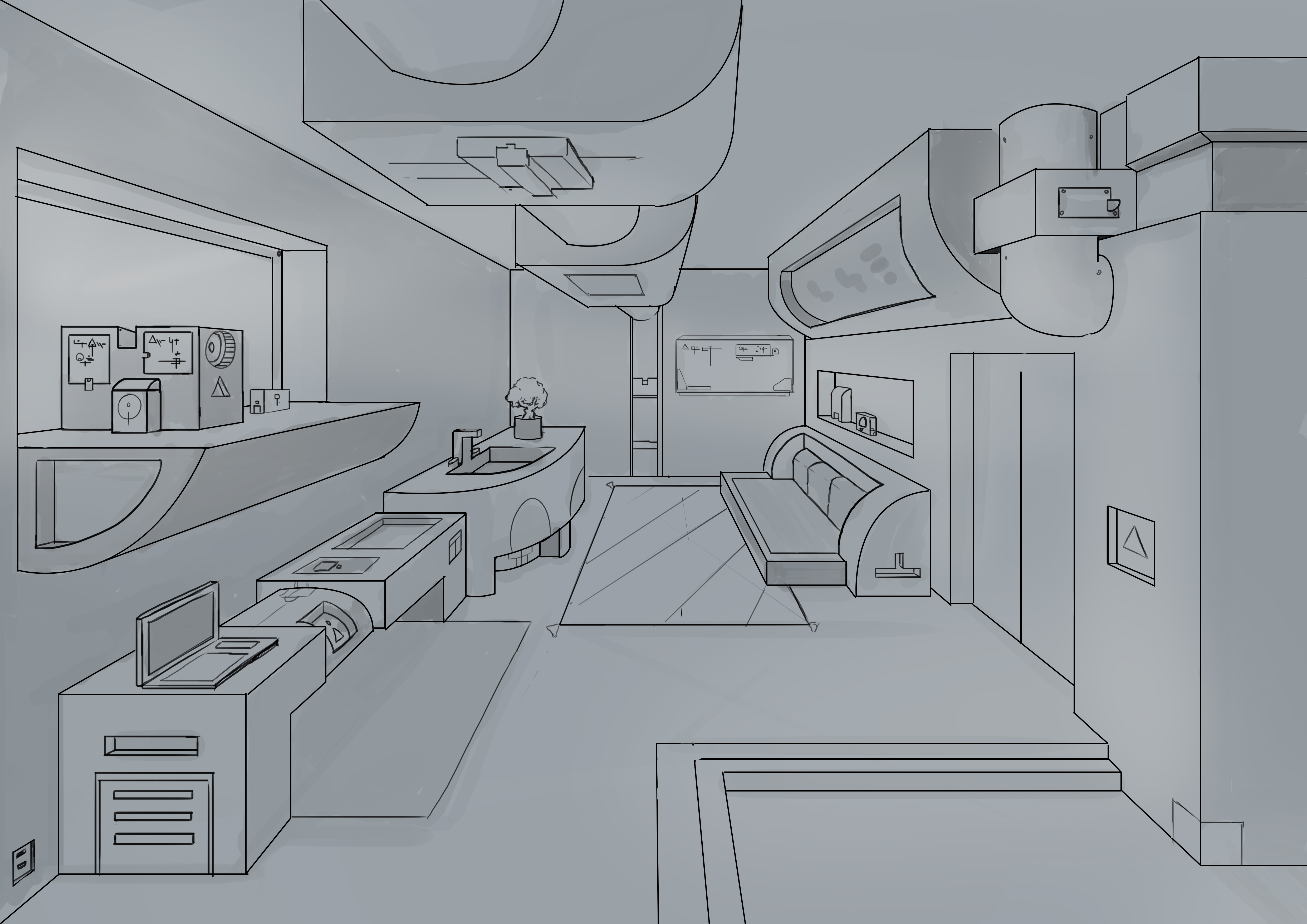
When it comes to adding details, just look around your room and keep on adding things that you see. Marc is very fond of saying to use 3rds in what you do, so fill up a third of the space with some detail, and then a third of that space with even more detail.
To add some more depth to your image, place something in the foreground frame that you can only see part of, look through the posts of other people from term 1 and 2 and see what people have done.
As far as specific recommendations on this image, there are a couple of things that can be fixed easily, and some that require a good bit of reworking.
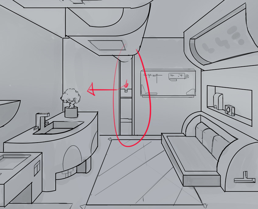
The size of objects inside of a room are pretty standard, but drawing them in 1 point perspective is jarring because its not real, just approximations of reality. But you have to get things to be about the proper size for it to look right. In this image I placed a man silhouette to show you.

I placed his eye level on your horizon line, and then projected him out into the scene, you can see that your doors and desks are too low for a person of equal height to the person who would be seeing this room. I don't remember if Marc went over this trick in the class, but I do believe it is in one of the streams, there are I want to say around 40 of the streams posted up on youtube, they are very handy to watch in addition to the classes.
Anyways, you can just look at the height things should be and correct the perspective lines.
I would also recommend taking the vertical pip and box in the back of the room and shifting it off to the side. The box functions as a compositional point that attracts the eye and makes it appear that the perspective is "off". Just move it off to the side to eliminate that effect.
But its looking good, just keep at it, correct the proportions of things to fit the viewer and you will be chugging along.
Welcome again!


 May 11, '19