• Gave myself 5 days to do something. This is what I managed to do. I'm trying to get better at illustrations, but I have patience to work on something for 3 days maximum :( Splash_Process.jpg5000x3140 2.21 MB Splash_Process-6.jpg3896x2429 2.83 MB concept list char copy.jpg5388x3000 1.7 MB
    21.0k
  • Did a character concept for a course.https://www.artstation.com/artwork/P6gm3y - more:) list1.jpg3541x1920 2.82 MB
    21.0k
  • Day 4: Star Wars May The 4th =] Queen Padmé Amidala in my art style! First time drawing her and I really enjoyed making this one! Used watercolours, ink pen, acrylic markers and gold paint for accents on my Canson mix media sketchbook. I hope you like it!
    83.0k
  • A creature design from a while back
    by
    6.7k
  • Here is some more recent stuff, I need to make more body studies
  • It's been a while and god, it is so cringe to go through all previous messages xDmy study.
    21.0k
  • Thank you! I finally cleaned that up. Meanwhile started 3 more ..I have a habit of taking too long to finish a piece, then I lose interest in it and just start something else. I found 8 from recently i started and abandoned, that are decent enough to not delete, but not finished. There’s also been a number of drawings I felt I “outgrew” - became better before I finished them, and it would be easier to start from scratch than fix them. Anyone else thinking that?
  • Lady Death Fanart Collectible: Part 6 Polypaint and base Hi, it’s time to share with you another part of the process to create this fanart piece. Polypaint As this is my first collectible fanart I didn’t have previous experience with polypaint so I tried my best and played a bit with it.I wanted to give a ghostly and eerie look to Lady Death, she is beautiful and deadly, but at the end of the day she is a woman that died and was reborn at hell as an avenging spirit, that’s why I gave her skin tone a bluish very cold tone.As you will see I gave myself some creative freedom to deviate from the traditional color scheme that this characater has in comics and illustrations.To add a bit of sensuality by painting some freckles on the face and the chest. The dark nature of this character was the perfect excuse to gave her a kind of goth make up, very dark shadows around the eyes, blue lips and fingernails. I know that the original character includes sexy red lips but I wanted this girl to have a sexy but at the same time creepy look, that’s why we can see some thin veins emanating from her eyes. The biggest chromatic change I did for this character is at the hair. Lady Death has a characteristic white weavy hair but in my fanart I decided to gave her a very saturated blue color.The reason behind this wasn’t only an aesthetic choice. I want that the face area strongly pulls the attention of the viewer so this area needed a stronger contrast. Another reason is that I want her to have a more modern look, as I mentioned before, I’m strongly attracted to women with goth/punk look. I gave myself half an hour or more to analyse the work of experienced sculptors that create collectibles and I discovered that the use of darker values on the skin is often applied to create a greater sense of volume and three-dimensionality. I found that areas with heavy ambient occlusion are the perfect places to paint with darker colors in order to increase the separation between different forms. Even though she has a bluish skin tone, I used a bit of warmer hues in areas that, in real life, tend to go towards red and pink, this is very obvious in the nose, cheeks, and knuckles. Thinking with a logical mind it’s completely absurd to have warmer tones on the body of a zombie like creature but I didn’t want to limit myself by using only blue tones, it looks boring and artificial. In real life these colors are created by blood vessels in areas where the skin is very thin. ** Scythe **for her weapon I applied a cool gray with some warmer variations, this color scheme is influenced by the work of H.R giger. Base I’d like to talk about the design for the base which, to be honest, I forgot to develop along with the character.My main idea with the base is to show that Lady Death inhabits a very sterile and arid land, at the end of the day she is at hell.You can see a that she walks over dirt and rocks, a sign that she’s surrounded by death and loneliness. As part of the landscape we can see some bones and skulls to reinforce the idea of lack of living creatures, yet we can see three hands that try to reach her legs.This hands represent that all creatures are subordinated to her power and seek an evil blessing with a simple touch of the princess of the damned.1- The hand with skin burns represents the souls of those who are newcomers to hell, tortured souls that suffer for the sins comitted on earth.2- The hand with greenish rotten skin and pustules is the reminder of the decay that has infected the souls of those who have been trapped and have forgotten their humanity3- Last but not least, the hand of a demon shows that even dark creatures and entities bow before her presence. The cherry on the top, at least in my vision, are the simese twins that emerge from the ground, this malevolent creatures remind us that in hell there’s only perversion and any trace of innocence is lost. Thanks for reading till this pointI’m really happy to be very close to finish this creative journey, last but not least it’s mandatory to talk about splitting the sculpture in several pieces to be printed, this will be my last entry before showing the final rendered images. See yaMay Zbrush be with you
    1.5k
  • memory 2min gartic phone, used ref 2m gartic, used ref for pose 2min gartic 2min gartic 2min gartic 2min gartic memory memory memory memory study memory memory memorymemory memory memory memory memory memory study memorystudy study stylized left memory, right study study memory memorymemory memory memory memorymemory memory, porportions r offmemory memorystudystudy memorymemorymemory memory memory memory memory memory memory memory, right leg is a bit broken The feeling of only getting 1 - 3 likes on a social media post will never not be discouraging. But nothing is discouraging enough to make me quit drawing. I think the strategy of drawing a lot of stuff and waiting a while to post is good though rather than posting it immediately and then feeling that sadness on the next set of drawing
  • Urban Dragon Girl Wip Urban Dragon Girl_wip1.jpg5000x5000 1.11 MB
  • Long time no see! New artworks produced lately
    6.8k
  • studies studies juri study imagination, how I feel before a speech imagination imagination study something I drew for my presentation also drew this for my presentation, didn't fix the one hand being bigger than the other imagination + study study studies study study, I need to fix the face a bit based on screenshot from anime but in my style study. except for the eye study studies studies study. changed some things tho imagination imagination imagination study studies, except top right samurai based on anime screenshot wolverine studies, changed some of the poses a lil, not very good at all, but first time i drew the character ever. semi study studies study imagination imagination imagination , for first time ever i tried to draw over 3d model for middle pose, I dont like the result tbh, but it makes it much easier than coming up with it from memory.imagination, except right figurestudies imagination + studies, coming up with action poses r hard, these are not dynamic enough, I will redraw better ones in future. imagination , imagination imagination study, except for eye imagination imagination imagination doodles except for the two chrollos imagination storyboard thumbnail, idk if i ever shared this. my storyboards end up being a little detailed since i usually just draw in one layer.
    by
    22.6k
  • Quick fun sketch. CyberFish.jpg2394x3857 674 KB
  • Neon Gambit This is a fan art of my all time favorite character Gambit from the X-Men.I made this a birthday gift (26.04.2024) to myself and honestly I really do like how it turned out in the end =] I hope you like it as well =]
    83.0k
  • Art Blog - April to September 2023 Suffer a little burn out. Look at some memes. Here's some art from in between. critique.jpg1333x5736 1.77 MB
    20.7k
  • And some more! Been painting over them a bit more this time. Some variants I tried for the old guy using mainly the liquify tool. Someohow looking a bit like Owen Wilson (not intended :D)
  • Cafe sketch/color study
  • Hello! My name is Vithor, I am from Brazil, studied Design at a local college worked as an illustrator for more than 10 years. I took a time off around 3 years ago and am trying to get back in my art shape and maybe become professional again. Here are some recent pictures: You can find timelapses for most of them on my instagram: www.instagram.com Vithor Albertim (@vithor_albertim) • Instagram photos and videos 123 Followers, 638 Following, 19 Posts - See Instagram photos and videos from Vithor Albertim (@vithor_albertim) Comments and critiques are always welcome.Cheers!
  • @patrycja.lerch Thank you I created another variant, which might capture the witch look I was going for better
  • Thank you @daceronine! If I remember I save in google cloud, I will have to stick a note to do it more often. Lamp is from life. Poses are from refs but I look at refs for a while and then try to do it myself and look it up if needed. Outfits and rest is from imagination Something went wrong while installing system so we will have to wipe everything again... pc works but something is wrong. We will wait till internet is done and I will save everything on cloud this time Threads came out in eu. It's been 3 days and I had more engagement than after half a year on instagram. It feels really nice I hope it stays this way A portrait of old dude. It's the same character I posted a while ago. Inspired by Bayard Wu work. At first I thought of him as a bear but I named him Fenrir and I think wolf suits him better. Eye gave me a bit of hard time but I think it is fine now. I focused on face and forgot about area below. The way I draw hair clashes with greying hair. I had the same problem while doing Lohse's white hair. Does it looks like it is greying here? I love how desaturated red looks blue there. I keep lying to myself that I will use different color scheme but It all comes down to this blue and yellowish one it is just flipped this time Have a great day!
  • Been bad about posting updates on the forum. I figure I should just throw down stuff. instead of waiting until I finish something.
    14.7k
  • Havent done much this year since I am focusing on learning programming and deving my own Indie Game . But here 's a New Year Piece 2024 , she 's the mascot for my Game Studio - Lucid Realm : Lucid Chan ! LucidChan_v001_sketches.jpg3072x4352 973 KB
  • IMG_0637.jpeg3240x4050 1.6 MB
  • Long Crested Eagle studyI had so much fun making this one and honestly I love that Eagle! It looks so cool! Used for this one high quality watercolours, high quality watercolour sketchbook/ cold press and it was 300 grams paper.I hope you like it!
    83.0k

So Many Thanks

@Watercolour Thank you! Thank you! I saw your portrait and I think your break must have must have been good for you because you knocked that piece of the park.
@mitsuki-youko I really appreciate the time and effort you put into the forums and popping into peoples threads for the encouragement. That takes dedication and you brighten a lot of peoples day.
@Ginungar So glad to have a new poster in the forums. Cant wait to see more of those medieval persons!


I Forgor!

I made one of the most comprehensive and in depth critiques I have ever done this summer. It took me a week to produce and was really fun. I hope you all can stop by and give it a read or share it with friends. Thanks.


Foreshortened Gesture Method

Part 2


By Request of @uraniumpuppy

Disclaimer - I know you are excited to get some answers. But I need you to read this first.

So I want to tell you that what you are considering "my method" is just a hybrid of things I have learned before. And what I am teaching here is a dumbed down version to demonstrate an idea in this medium (an internet forum). It is also a window in time -- a view as to where where my brain is now -- as I cannot say this is the end all be all method to solve your problems (but it might help) .

And Although I had a short professional illustration career - my education trajectory was cut off by me getting that full time job (and my subsequent jobs) and there was still so much more for me to learn. Ce'st la vie.

I have had some amazing teachers. And thankfully some of them still teach and contribute to various places.

Some of them studied at the same place that Proko studied.
(proko--the source of your reference).
Another one of them has a podcast with Proko and might be an alien.
And another created great breakthroughs for me.

So what you get from a Proko is a hybridization of a method that was taught to him. As are my teachings are a similar hybridization of all of the above linked persons. In a desperate attempt to make clear that cloudy area of drawing and composition.

Because the format for the education I received was shorter and not as intense as the atelier -- and thus was built around the smooshing of ideas into student's minds as fast and bluntly as possible and moving on -- sometimes that student missed something by daydreaming.

I am going to rely heavily on the books for this one to get my points across. Lets get started


**

  • First

**
You need to know the landmarks of the top and bottom, front and back of the torso masses. When you have a reference that you are doing gestures from, or quick sketches, you have to rely on this anatomical knowledge to inform areas that lack information hidden by overlapping forms

**

  • Second

**
You have to look for these extra spots that reinforce the direction of the big landmarks.

**

  • Third

**

**

  • Fourth

**

**

  • Fifth

**

Final Summary.
Landmarks, Landmarks, Landmarks..Find them, Hit them, Move on.

Having elements of the body overlap will trump some of the principles taught in the rhythm abstraction method that I use. But the Gesture abstraction that you can do in thirty seconds, which represents the motion between the parts, cannot be lost while you continue finalizing your drawing. In fact it is often encouraged so push the gesture in the beginning as a drawing will become more stiff over time.

It's a gentle mixture of rhythm, gesture, and form that are used to create something that you can build off of to create a twisting form. Most of the videos I recommend you -- will say what each of these things are -- but not show you how or why they are used in a 2 hour study session of quick sketches. So you have to do that on our own.

Rhythm abstraction will solve most of your problems as it uses gesture and some contour to form an interesting figure. I use it the most. This teaches some hard overlap. Landmarks and overlapping construction methods which rely on an armature like a pillow or a tube will help you solve different problems. This free book has more examples.

Doing quick sketches from 2-10 minutes can allow you to use a variety of the methods for figure drawing. All of the methods I use are taught by Proko and Ron Lemen. Ron more sparingly since he runs his own studio he is not regular in video production. Proko's business is video production so there is naturally more information there.

I recommend some of Ron Lemen's videos (posted in the link above.) They are very informative.

I recommend Proko's free videos all in one place on his site regarding gesture. Some of his old intros are cringe but you can watch most of this stuff in a couple hours and give them some attempts while you are at it.

Next time you want to post some art and get my advice I recommend the critique section. I try to contribute to that all the time so that I can keep learning myself. I think from here out I would like to keep this blog to just my artwork, and link to any critiques like I have before. I dont mind doing these two demo's but I dont want to set a precedent for people to stop by and ask anything. Dump it in the critique section.


Finally...an art


Just to post art to this blog and make it about that, here's another drawing like the fantasy elf above. Might keep doing some more like this.

I was thinking that exact thing after I posted my reply. So yeah, after this Its the critique section for me. And it'll be a while before I post again, since I am very busy and have little time to draw.

Again, thanks for the detailed explanation and additional links. I'll be going through them during the following weeks and absorbing the contents.

I really love your art style. I love the line quality. Do you usually keep these to just line art or do you ever color these in or do you go the path of just painting them?

Love this landmark summary, great for recalling theory after a long break :smiley:

Ok i read your post more carefully, I forgot about Proko’s podcast, it will do nicely for listening to at work, so thanks for that too :smile:
More importantly — why is Marshall Vandruff probably an alien, what’s the meta? I must know.

September 2024


Reply @'s


@uraniumpuppy It's all good bruv! I am glad for the opportunity to help anyone who asks. Look forward to the critique section.
@gregorya Thanks glad you like it, thanks for stopping by! Keep up that grind.
@uggievang Hey thanks for stopping by - Thank you so much I'm glad you like it - It depends what mood I'm in - I am currently drawing a bunch of characters to get some assets together to maybe paint later. If you scroll through my thread you'll see some old colored stuff. It takes so long to finish anything with my current schedule. So right now I'm studying with drawing and trying to get better at it and have some cool drawings to show.
@Watercolour Yoooooo! Marshall was the most fun teacher I ever had. Every question anyone ever had he would recall a story about how someone discovered, felt, emulated or loved the process or technique we were learning. He had a way of teaching by story telling that makes the wheels turn in your head like a story arc but for art theory. He would sing about you as you entered the class.

He teaches multiple subjects in a master class levels to pixar level studio seminars - and has been teaching for 40 years. He studies things that fascinate him with no barriers. A real treasure.


Art Dumpy


Open any and all in new tab to see full size.

These are all with no reference - and using construction methods to create them, and solve the problems along the way.

People seemed to like the process that I did for uraniumpuppy - and 7 or 8 likes is crazy traffic on this forum. I had made these last month but forgot to post them so I'll put them here. Pencil and Ink sort of final drawing mentality.
-1-

-2-

-3-

-4-


-5-

I had so much fun doing these torso's this weekend. Failing and trying again and pushing myself to find new angles and push the proportions. I am feeling excited to draw - zeroing in on the process for myself and staying focused on one thing has helped a bunch. Ready to take what I learned to some new drawings.

8 days later

WIP - "Pumpkin"


Sketch - Chrome Brush Krita

.
.
.
Lineart - Krita

I missed so many of your posts here, but I just want to see your art and insights are just always so great to see! It's always so inspiring to drop by here. Keep up the awesome work :+1:

Daaaamn that looks sweet! Specially the “rougher” value sketch, looks amazing.
Looking forward to seeing how it develops :smile:

8 days later

(10/1/2024) Wake me up when September ends...in 2024

Get @ Me dog!

@cedricgo Thanks man! your frog piece was freakin' raaad!
@watercolour Thanks! Cant wait to see you rip through all that old work stuff to completed pieces!

Critiques

CLICK ON THE LITTLE DOWN ARROW ON THE RIGHT IN THIS EMBED!! HOLY SH*T I COULD HAVE BEEN DOING THIS THE WHOLE TIME!!!
Helping out uraniumpuppy with some torso drawing tips!

Helping out ilovecookieforlife (awesome name) with some character art

Some Farts-

I mean ARTs. cant spell farts without it though....

.

.

WIP-it real good....

Been really focused on this one and I'm excited to bring it home this weekend...possibly.
The face was too much like shrek and too goofy, I wanted a goofy fun pose but for the head and face------and my vibe is a little more dark and less cartoony.

Gotta grab a face ref for the lady, and pimp out that armor and bit more to be less boring, mess with that leather piece on his chest...So heres a placer face for now. LOL

I think I want to make some stickers for Halloween! I'll make some monsters and zombies and classic stuff with some new found confidence in Krita.

Later Taters

amazing its coming along really nicely and I love the colors you used bouncing off the pumpkins

Thanks! I am glad you think so, because I feel I spend waaaay too much time on it :joy:

Very nice linework and anatomy on those "farts" drawing! And I think you really nailed the face of that guybholding the pumpkin. I don't think it can get any better. It's effectively perfect :joy: But seriously, the piece is coming along really well!

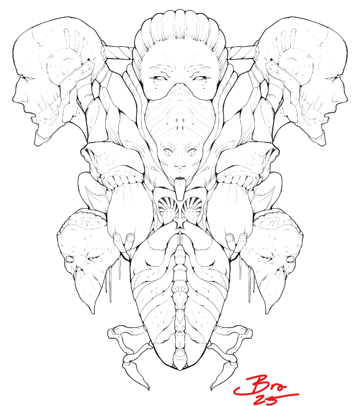
(10/6/24) It's Finally Finished: 'Pumpkins'

Ladies and Germs, I present to you, "Pumpkins"

"Pumpkins" came from a random idea after drawing recent torsos to practice the female variety. I wanted to draw some nameless fleshy broad, but also draw a troll or undead knight holding/swooping her away. What popped out one night was the first sketch you see in the process shot. I've been wanting to paint something for some time now and for some unknown reason this scratched the itch. It is rare when one is compelled to do something, especially what you weren't planning on. And for no good reason, its suddenly consuming your whole life.

I was inspired by the works of Paul Bonner on the game - The Dead Keep.
And random floaty haired busty anime women.

I will say that going to work and taking breaks, and coming back with constant fresh eyes was the best tool in drawer for this work. There are tons of mistakes, and more I'm sure I will find as time progresses. I didn't know when I was going to be done. But suddenly I was. I couldn't find anything else to adjust or noodle.

Last midnight, with completion on the horizon, tired and whispering over heretic runes - drastic changes and - "redesign regret"- loomed. It was the next day with sobering sleep clearing my tainted mind - I realized, "f*ck that just finish it..."

Details:


.

.

Process:

I painted multiple parts of this painting at least three times. It took so much longer than I wanted but I didn't let that stop me. I just kept plugging along fixing things till it was done. I just told myself the whole time - Learn from this, you will just do it faster in your next piece.
.
.
.

Thoughts:

Krita, I love it. It never crashed. It has gradient maps. It has the most incredible and diverse brush engine. Every thought that I had to change a brush to my dearest whim - was granted upon mere clicks and scrollings. And it is, free. free. free.
H - O - T - T - O - G - FREE....... b*tch....

I will be donating money to them as often as I can. I only feel so bad that I gave so much to Adobe, which I could have given to these wonderful people too support their efforts.

From this great effort is born much learnings. Interestingly - of what I need to learn next. What I struggled with so much and for so long is now my nearest motivation. Where my biggest time sinks were and my greatest regrets. I look forward to sharing them all with you someday.

Yesterday resulted an epiphany - regarding the absolute fundamentals of picture making. It involves theories from several sources. From finding the answers for others, critiques, tutorials and musings. It is simple, iconic and ideally - unstoppable. It ties together the contrast of all principle fundamentals, ratio, and the elusive application of mood.

Right brain emotions and left brain math finally combined in an ultimate symbiosis, and ANALOGIZED for you. It might look and sound mad. But who gives a shit.

I cannot wait to put it together and show it too you. It's symbology can be contained in one note card.

Get @ me Bros

@uggievang I cannot tell you how long I held myself from completing that stage - because it was...fantastic. I'm sad its over. lol
@cedricgo It is my magnum opus. Far more effective than its complete version. Its like shall never be seen again.

Later Taters

Nice work on the female torsos and faces.

The orge looks interesting. I his expression and the details on the knight's armor. It looks like the orge is having a pumpkin feast and wants the knight to join him. And glad you like Kirita.

6 months later

Im a bit late, but still, the troll gives me massive warhammer aos troggoth vibes, well done! :fire:

NOV 2024 - APR 2025

Back at you 'bros'

@gregorya thanks so much for the wonderful comments and visits! Keep that sketchbook going strong
@Ginungar that's awesome! thanks so much for stopping by!


New Year New Us

I have had a nice time taking a break for the holidays after burning out from 'pumpkins' a bit. But I know from experience that most creative types slow down to a hibernation state - to recoup in their family caves and gorge on chocolate. I knew winter was coming so I did the same.

I tried to pick up where I left off with my studies of the the human form from imagination. After these I find the need to fill the reservoir with new information from masters and reality. It is a fine balance to keep - on top of day to day activities it is easy to lose track. This is my escape after all and not my full time profession anymore.


Critiques

I had a wonderful time helping out a few people over this time period.

TTRPGBREWSTER

This was the most I had ever written so far in one critique section. It took two weeks of correspondence and was a real joy to see the improvement. I recommend seeing ttrpgbrewsters serious improvements in just over two weekends - while following the basics of fundamentals. Get a snack, a boba and and put a fat pillow under you for this one.


GINUNGAR
Ginungar had a wonderful comic project worked on - and pushed it too the next level.

MAPLE-SYRUP-FAIRY
Maple learned about head drawing and the complications. Zeroed in on solving the problem.

BWAUSE83
B had some dope figures that needed gesture and design improvement and nailed it.

VISCERATED
V had some dope character designs to work out.


I hope all of you can read and learn some things from the critiques provided through others. This platform is great 'old school' internet style for that. Go give them a read and a like and make them feel heard.

You want doodles? I have oodles.

Some sketches when I had time.


.

.

.

I'm still working out the two ideas from online teachers and how they are tied together in some wild symbology. Unless you have read through and have their work this might not make much sense. Forgive the miss spellings.


-
-

-
-

-
-

-
-

Suggested Topics

Want to read more? Browse other topics in Art Blogs or view latest topics.