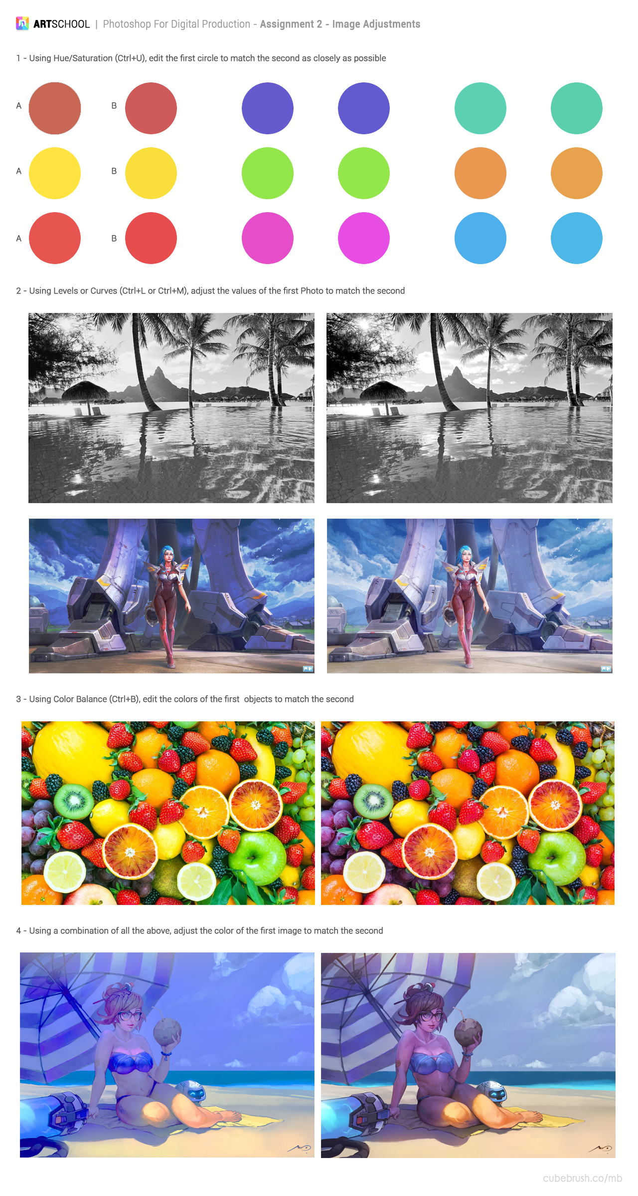
It has been a while, but I'm back at it again with homework from Art School Term 1!
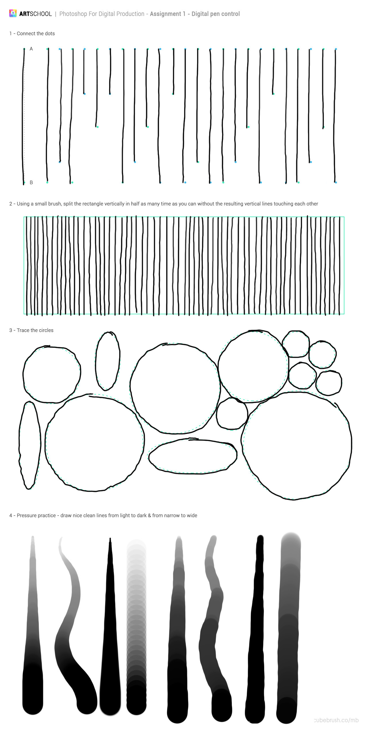
Even though it may seem easy, the first exercise has to be the hardest of all as I'm drawing on glass and the pen movement can be bumpy at times. My first finished exercise wasn't so good so I've redone it and the lines are more on point now.
There's nothing too tricky with this exercise apart from the last which I struggled for a while sigh... it's the best that I can do 
Since it's the first time I've experimented with photo manipulation, I've just combined two images together from Google. Wasn't really too creative, just a castle by the lake. Worked out well in the end.
And here are the two images that I've used for this...
Duplication exercise:
This looks a bit freaky (but not as freaky as the young model with the extra eye 

Had lots of fun with this one.
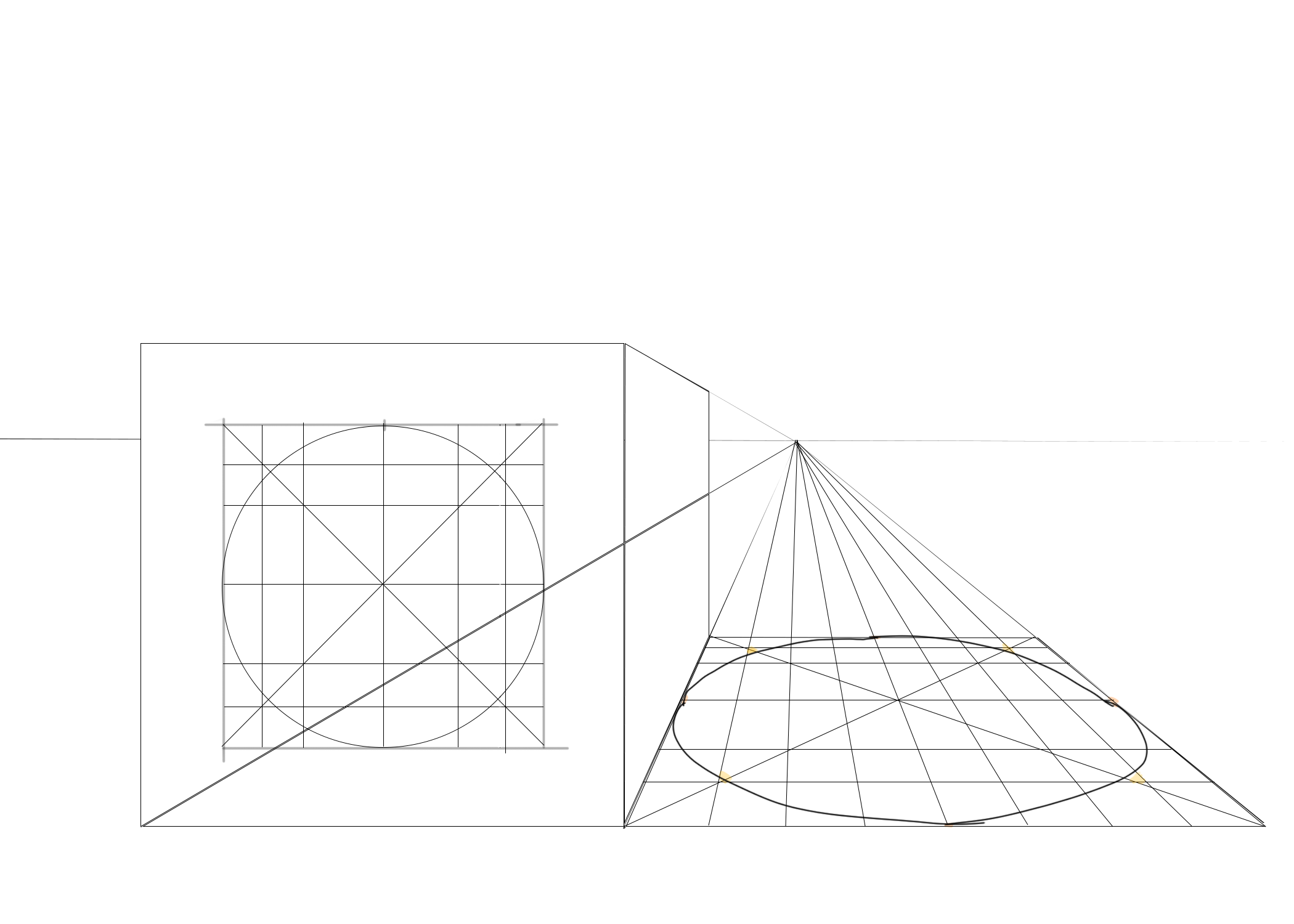
Not sure this was an exercise, but here's a box in perspective.
I think that it's a bit hard to get a photo reference that is in one point perspective. I gave up after my second try haha but may get back into drawing the lines again once I'm familiar with muti-point perspective. Marc did say that there are multiple vanishing points that can be in a photo so I wonder if the other lines converge in different points in the image... I guess I'll find out after learning about more perspective. Really keen to draw buildings/scenes from my own imagination one day so will work on the second perspective exercise in Term 2.
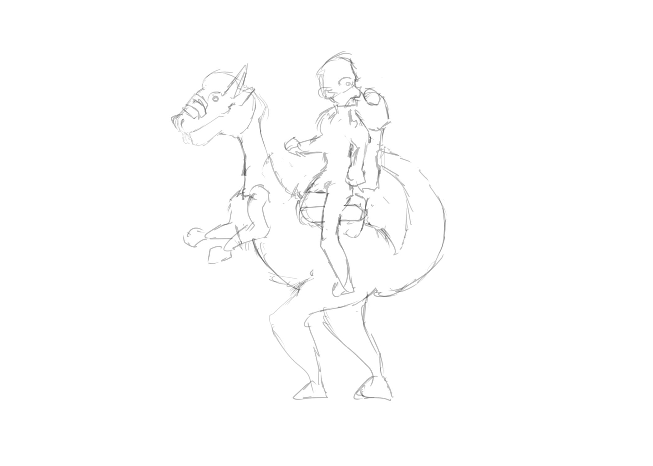
These sketches are 30 seconds to 1 minute gestures. After copying almost all the figure drawings in the anatomy book it made it easier to draw the poses since I've done the hard work first!
Models that I've tried to draw over. I have to say that I've cheated on this as I wanted to jump straight into drawing 3d cylinders before doing the action lines/skeletal form haha 
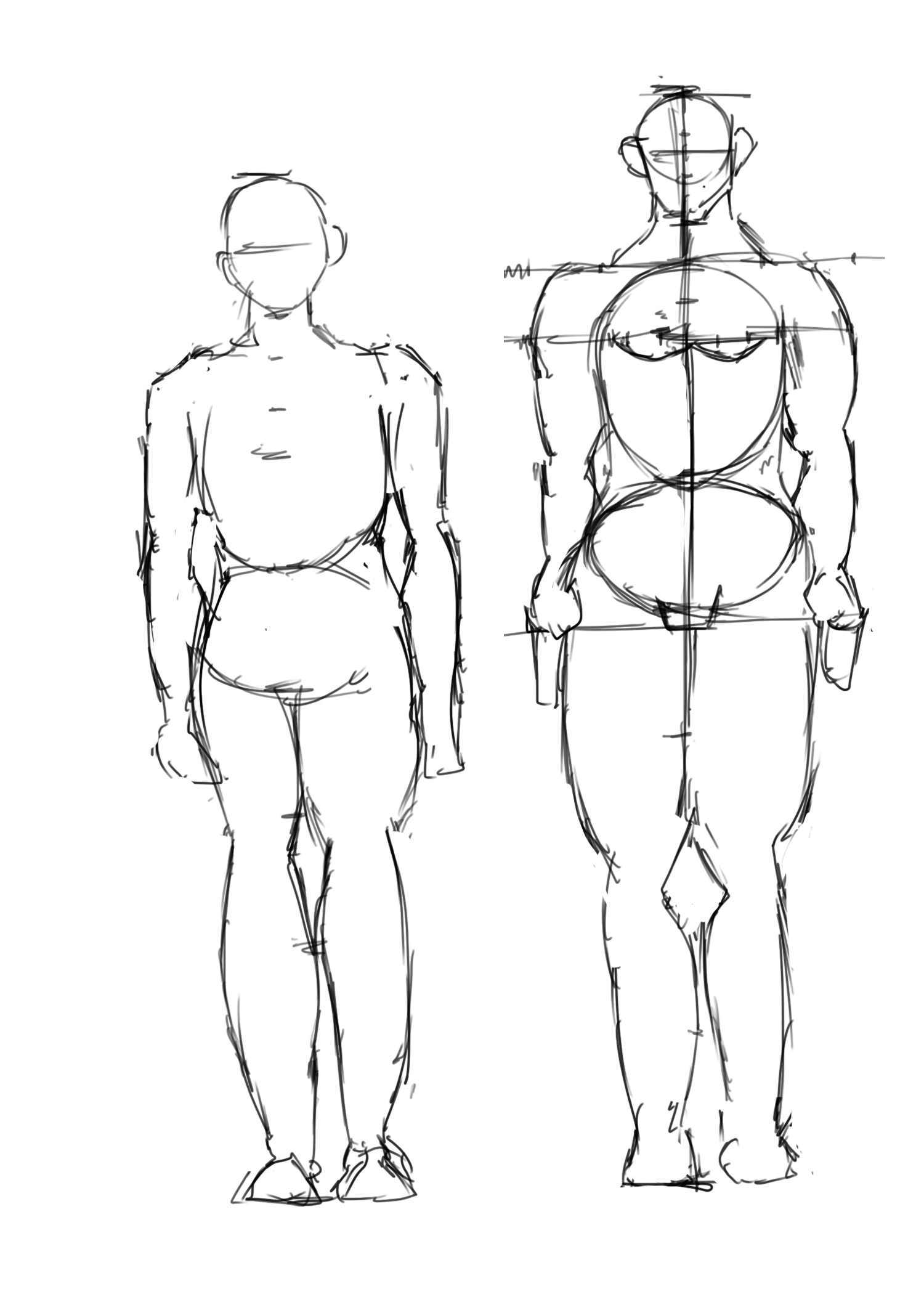
Proportions. Definitely need more practise with this one as I'm looking to do anatomy studies and figure drawing in the near future. The drawing does look messy so I'll do my best to clean up the other figure drawings that I'll do next time.
Now this worked out on my second attempt really well as you can see in the overlay of the second image. The drawing that I did turned out to be too large, but fitted really well as I scaled it down. Was pleased with this result! 

I've decided to pick the weakest aspect of the first term and use it to improve my skills in the second term. For me the weakest aspect which has been for a while is human anatomy which I'm really looking forward to doing in Term 2 and Term 3. This is a good lead from my previous artwork history as I've been trying to draw dynamic poses for most of the artwork that I've been doing over the past few years. But doodling these poses will only get me so far, so doing the anatomy courses is the good next step after reading the figure drawing anatomy book. I'll be posting up more work from the figure drawing book in the weeks to come.
As far as the game development has been going, I've decided to learn Adobe Illustrator for vector drawing to do graphics for 2d games. I'll be starting work on a game soon with my friend so hopefully I'll be able to show you some (hopefully cute) clipart soon!


 Dec 14, '17
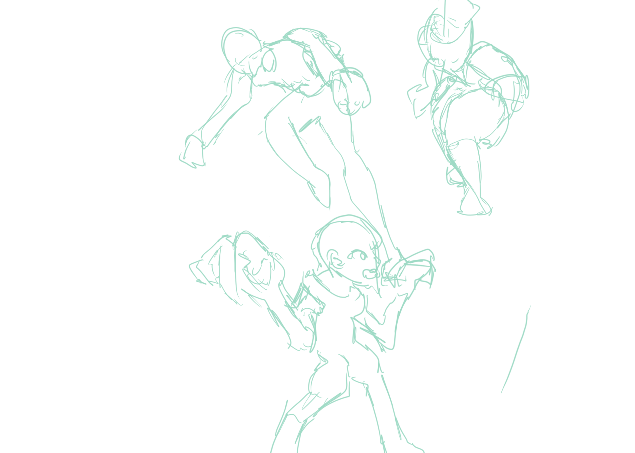
 ) that I find that are worthy of note. These particular sketches in this piece stands out because of the way I've drawn the figure to show foreshortening. In this case the foreshortening is extreme and I liked the way it has turned out. There are rare moments when I do get the foreshortening and perspective right, and in these moments I cherish the quality of my work.