You're paintings are so good!! I'm so jealous of your painting skills  I can really tell that your studies are helping you too!
Do you have any tips for painting? Your colors are very clean and I've always had trouble with them getting muddy.


You're paintings are so good!! I'm so jealous of your painting skills I can really tell that your studies are helping you too!
Do you have any tips for painting? Your colors are very clean and I've always had trouble with them getting muddy.
Hi @Shellac-Belly!
Oh yeah I do have some and thanks!
Nah it's just a lot of trial and error and observing how other artists do it. My paintings were really muddy too :') The biggest reason why my paintings were muddy was that I wasn't conscious/aware of my colour choices enough? :'D
But now that I'm taking my art studies more seriously, the information I got from watching art vids is starting to click in my head lol :'D. Wished I wasn't just lazy and start implementing those tips more.
Haha about the tips actually my friend just asked me about that too . If you don't mind I'll just post what I've just said to him below 
Aye thanks man! Yeah sure. I think colour picking alot of like artists works. You will start to see that their colours are not random but have a certain pattern in them. So I believe that they do know how to sequence their colours in some way. You can see in some speedpaints they will have colour palettes in photoshop open and for some artists, they will say how they pick colours and it's through a certain order in the photoshop colour wheel. So it's all very technical, you just have to compare the value and saturation numbers in photoshop, and you will notice how the colour patterns. This might not be for all artworks. I haven't compared enough HAHAHA
But my values still need work. You still have to eyeball and adjust for the prepicked colours cause you might have picked wrongly, so if you have to make certain colours lighter or darker or saturated just do it. 🤔 It just helps you so you won't stray too far from the set values and colour theme yeah.
End of convo.
I think I have examples in my above paintings. You can see that I wrote out the colour values and saturations of the colours I colour picked so you can try doing that too! Just have to keep trying to breakdown other artists works enough so you can see how it works. I never really did this because I wanted to be " original " but yeah just do it!  Like that quote: You have to know the rules before you can break them :''')
Here's some videos too that I think will help with painting and some other tips I got:
- Knowing how light works on objects, the terminator, highlights
- Notice Value Changes/ transitions in light and dark. Here's a video where I got of that
: https://www.youtube.com/watch?v=Nuhd2TgAlPY&list=PLwbkBfXxH3HCu0wR_K3ncvb0ks4qwV9d3&index=14&t=0s. I think this is most important after you have established the basic lights and shadow areas of your painting. This is where your painting will really pop I feel. I think, in the beginning, I never took notice of this but in lights and shadows there are also differences in them. Like in shadows, there're terminators/ bounced light etc. and these will affect the values in the shadows and light have its own thing too. You can see it happening in these sphere
A phrase that helped me understand this well is the darkest light cannot be as dark as the lightest dark. Somewhere along those lines.
If you implement these it will help add more depth to your painting!
- Soft and Hard edges for lights and shadows *
- Knowing your the object your painting forms and PLANES* ARE IMPT. Like from the Asaro's head, I think that was a key part in helping me paint better. It helps you how to separate the value groups of the head easier
- Simplify Shadows and light in shapes and know where the light is hitting
- Brushes and your strokes are important! Test your brushes and make sure it gives you the results you want. I know there's a lot of videos out there that says it is not ABOUT THE BRUSH and I can tell you I think I spent so long painting and having a hard time getting the values that I wanted JUST CAUSE I STUCK WITH THE DEFAULT BRUSHES. It's really about the BRUSH so yeah just make sure your brushes settings work for you :'D.
-Paint in the contours of the object. If you have sloppy strokes, it will show.
-Paint Step by Step, don't jump to painting details too quickly. - I fall victim to this so much in the beginning and I still do sigh. Always try to fix the main problems like proportion, light and shadows etc.
- Limit Palette, decide the value range of your painting and what colours are needed before you paint. - The thing I realise if you were to pick paints as you go, you won't keep track of the colours are using and eventually, things will start going muddy. I think this helps minimise that the most! You will have an easier time trying other colours once you have the palette working.
Other tips:
There's a video where it says to have a good painting you just have to have 5 steps of values. I guess it's true from what I've gotten
-If you're using photoshop, I think one useful trick I learnt you can do to see your painting in grey value in realtime is to go Window> Arrange> New window. It will duplicate an identical canvas as the one you're working on. The useful thing about this is it keeps the settings in each canvas separate so you can go View> Proof Colours> Custom> Select Grey Dot 20% to see things in greyscale and just pop the window out and downscale it so you can see the greyscale of your painting.
-Try your best to replicate someone's painting you admire to the best of your ability/ photography. I think this helped me the most when I was starting to paint because it really forces you to think about how to prepare your painting so you can get the end result but it will take a long long time though. I spent almost 24 hrs on a painting.
or you can just get Naranbaatar head tutorials, I think he covers some concepts I stated above really well and you can see how it all comes together! It's really good not only for painting but for construction too which is important too if you want to paint well. You can also learn how to organise your drawing process more T u T.
Sorry if everything is all over the place, I just like to ramble without organising my thoughts well haha. I will try and organise better next time, I hope it is still helpful in some way :'D
I did another painting study from the same ref as the previous painting study I did. I really like the colours they used in the video so I wanted to paint it once more. The head in this reference was a lot more difficult so I guess I have to practice drawing heads in more complex angles more T - T
I'm happy with how the colours turned out but I really wanted to capture the same feel as the previous study for the skin but I wasn't able to do it :''D I thought the skin in that one looked pretty cool but I guess this has its own vibe too.
Here's the process:


11 days later
I took a break from studies to do something fun. I'm really happy with how the colours turned out but er I guess I need to learn how to properly make use of my line art with the right colouring technique. I think the black outline kind of mess with my brain so I can't paint properly lol. I will get back to doing proper studies after this 
I played around with the photoshop filters etc. to get this effect I guess I learned some cool stuff!

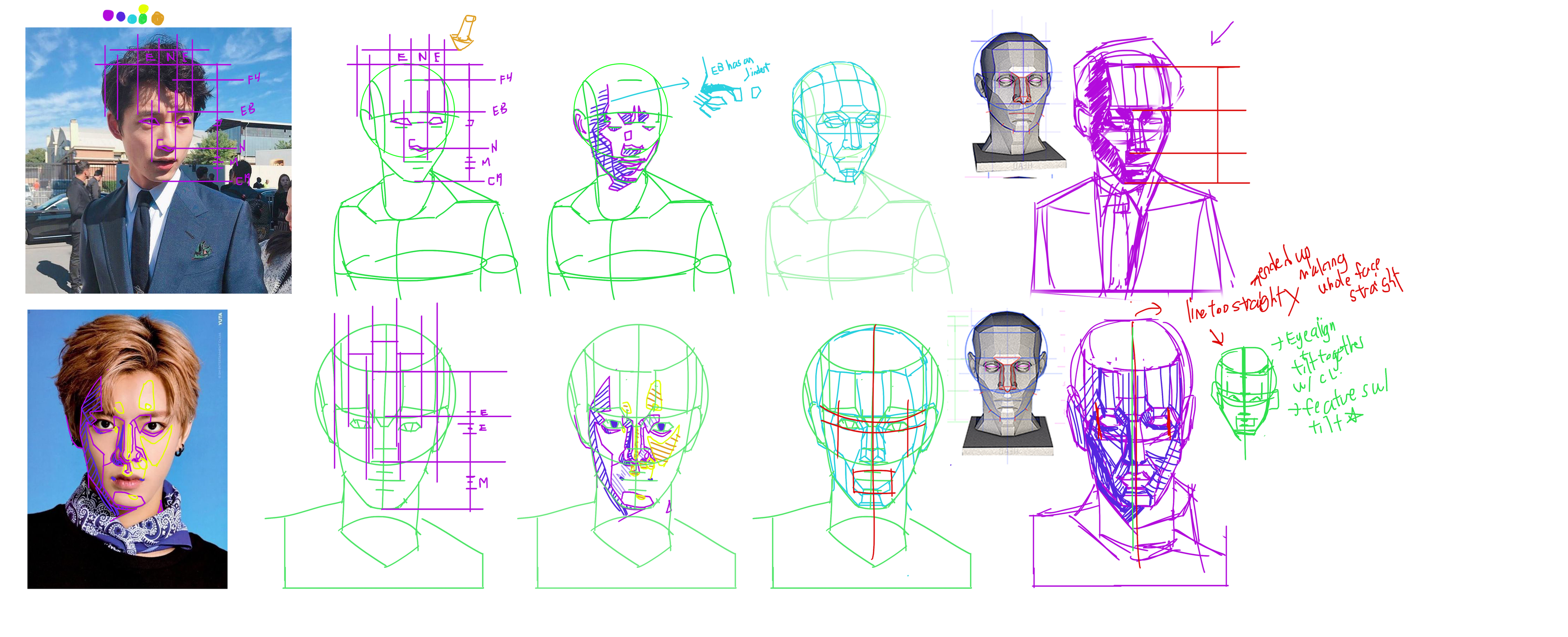
Some head proportions studies I did. I'm slowly taking the time to understand things. It's more helpful now, I'm beginning to see what are the mistakes I'm making and understanding the heads I'm seeing better. Now I'm just figuring how to rotate a head around and it's messing with my brain HAHAHA. I guess I'm just used to drawing heads intuitively but when u start wondering what actually changes when the head turns, yeah that's when my brain starts hurting.
Well I'll slowly figure it out somehow. 


Another page of head studies. After doing studies for a while, I'm starting to miss doodling but doodling for me has started to become a sort of fear cause many things can go ugly when I doodle. I think I just need to overcome that and just focus on exploring ideas more instead of doing a perfect drawing. It's probably one of the reasons why I keep holding off from exploring my ideas cause I feel like I'll never be able to do them or I'll fail. I hope I'll eventually learn how to try without fearing to fail. I'll keep working on it T-T 
Did some practice sketches. I should think about each drawing process more AND STUDY. You can see the last sketch looks much more controlled because I took the time to think about the process... I NEED TO DO THAT MORE OFTEN instead of randomly hatching = U = hope my brain will do it.
8 days later
I did some head breakdowns. Was in kinda a slump lately... Sometimes, I feel overwhelmed by the many things I'm lacking that I ended up not knowing where to start again. But when this kind of thing happens, the best way I figured to overcome it is to just pick something and simply roll with it, I'll start to know what to do eventually... I just have to keep hammering at it!
And also hey, I think I'm getting better at doing breakdowns, I managed to organise it better too 
Some more head and eye practices that I did but didn't upload.

I finally took the time to relearn and understand the body more by practicing proportions again. After 3 years of constant gesture drawing and practicing art, I still kept drawing bodies wrong. Now, I'm just really wondering what I am doing wrong so I just decided to go and look back at the basics. This is not my first time copying or studying human proportions so I don't know why is it so weird that only now I start realizing the mistakes I am doing compared to the previous proportions practices that I did.
Technically since 3 years ago till now I've always made the same mistake but the only reason why I notice them now is that I am conscious of these issues?
I guess now I only come to realize what conscious learning is about. In my previous times in studying proportions, I just drew them without questioning how it relates back to my understanding or to the figures I am drawing so no conclusions were made and not much was being learned. At least now, once I started to make comparisons and seek out the answers where my problems are, I can finally understand and fix them 
I don't know but it's just kinda frustrating to see how long it took me to come to this realization where I finally start putting more effort into studying efficiently or understanding what studying actually is.
And it only happened when I am desperate. I hope in the future, I won't just want to be better out of desperation cause it really makes me realize how much time could have gone by without me making any difference to my life  Wanting to improve and asking myself how do I get better ( faster ), I wished I did that more
Well at least, I realized it now T u T It's never too late to turn yourself around I hope.
Now I am just having trouble deciding what to improve on or what to do because I feel like if I focus on one aspect I will neglect the other. In the end, I ended up half-assing the practices I'm doing  This is tough
If you guys can share any advice or about your own studying methods I'll appreciate it! 


I'm planning to get back to painting again and start working on more finished pieces. Hopefully this time I will get it done I MUST 
What you're going through definitely feels relatable and I think a lot of people goes through that step. And it's certainly a bit disheartening to feel like you've ''wasted'' so much time, but all those things you did still helped you built some skills.
For me, realizing my own shortcomings was what motivated me to want to improve. I think it's because we get told to study anatomy and perspective and all that stuff, but I think I never fully really got the whole reason why until I realized my own shortcomings. Once that happened, I started figuring it what I should work on and I also had a reason to do it, which I guess might be was what I was missing. Doing studies and practice makes way more sense when you have a reason or a goal, than just doing it because you think it's what you're supposed to do or what you're told you should be doing. So maybe it was a necessary step to go through in order to help you eventually figure out what you now want to achieve.
Don't know if that made any sense, but you have the rest of your life to improve. And don't be too hard on yourself. Use what you're feeling as a motivation to improve and draw all the cool stuff you want to draw! 

Hello @cedricgo, thanks for taking the time to write your reply! Yep no worries, it makes sense! It definitely made me feel better about myself
Yeah, I agree! That's why I kinda feel like those artists who have original characters or projects will see the most growth? Because they always have something to go back to and improve on. While for me straight, in the beginning, I never really had a purpose other than getting better in art 
Sigh, I keep wishing I can go back and start off on the right foot but alas I can only move on. I will draw my cool stuff one day Tu t
Thanks again for the nice message! and I hope you're doing well!
You're welcome! I'm glad my words could help you in some way
And yeah, I think having a project or even just a general vision of what you want your art to have can help since it gives you a goal or direction to focus on.
I wish you all the best for your art journey. I look forward to see how your art will evolve 
And yes, I'm doing well!
29 days later
Wow, I just realised I haven't posted in a while... Just an update, I've been spending a month or so going through How to Draw by Scott Robertson I can say that I now understand a lot more about perspective and perspective grids! I don't really have much to post other than practices I did from the book but hopefully soon. I really want to practice drawing motorbikes so I will mostly post those studies soon 
22 days later
Welp, I don't think I'll be doing those motorbike studies till I'm happy with my human studies. I feel like I'm closer to figuring out how to draw people better  just by trying to memorize and understand the human proportions grid and applying them. It helps me relate back to the drawings I did from photographs :'D and how to build the body from the basic frame. So I'll keep working on that and post my more progress more frequently! After that start practicing perspective and keeping things consistent and then other stuff.
Other useful methods I think helped me:
- Comparing verts and horizontals and seeing how the different body parts relate to each other hmmm
-USING GRIDS TT IT MAKES COMPARING PROPORTIONS SO MUCH EASIER AND THOROUGH. Both vert and horizontally.
-Organizing the way you study and make sure the practices you do can relate back to back??? It's kinda better than just setting a goal for each practice :/, it helps set up for the bigger picture ( both is good too )


Some different practices I did 

| Topic | Category | Replies | Views | Activity |
|---|---|---|---|---|
| antCGi - Getting back into painting | Art Blogs | 2 | 934 | Aug '18 |
| Kroy’s Art Blog | Art Blogs | 0 | 675 | Feb '20 |
| BroHawx’s BroBook | Art Blogs | 123 | 20.2k | Oct '24 |
| Alex Cobra’s Art Journey | Art Blogs | 5 | 1.2k | Oct '20 |
| Matt’s art and studies | Art Blogs | 0 | 519 | Sep '16 |