


 Thank you! I finally cleaned that up. Meanwhile started 3 more ..I have a habit of taking too long to finish a piece, then I lose interest in it and just start something else. I found 8 from recently i started and abandoned, that are decent enough to not delete, but not finished. There’s also been a number of drawings I felt I “outgrew” - became better before I finished them, and it would be easier to start from scratch than fix them. Anyone else thinking that?in24.2k
 Lady Death Fanart Collectible: Part 6 Polypaint and base Hi, it’s time to share with you another part of the process to create this fanart piece. Polypaint As this is my first collectible fanart I didn’t have previous experience with polypaint so I tried my best and played a bit with it.I wanted to give a ghostly and eerie look to Lady Death, she is beautiful and deadly, but at the end of the day she is a woman that died and was reborn at hell as an avenging spirit, that’s why I gave her skin tone a bluish very cold tone.As you will see I gave myself some creative freedom to deviate from the traditional color scheme that this characater has in comics and illustrations.To add a bit of sensuality by painting some freckles on the face and the chest. The dark nature of this character was the perfect excuse to gave her a kind of goth make up, very dark shadows around the eyes, blue lips and fingernails. I know that the original character includes sexy red lips but I wanted this girl to have a sexy but at the same time creepy look, that’s why we can see some thin veins emanating from her eyes. The biggest chromatic change I did for this character is at the hair. Lady Death has a characteristic white weavy hair but in my fanart I decided to gave her a very saturated blue color.The reason behind this wasn’t only an aesthetic choice. I want that the face area strongly pulls the attention of the viewer so this area needed a stronger contrast. Another reason is that I want her to have a more modern look, as I mentioned before, I’m strongly attracted to women with goth/punk look. I gave myself half an hour or more to analyse the work of experienced sculptors that create collectibles and I discovered that the use of darker values on the skin is often applied to create a greater sense of volume and three-dimensionality. I found that areas with heavy ambient occlusion are the perfect places to paint with darker colors in order to increase the separation between different forms. Even though she has a bluish skin tone, I used a bit of warmer hues in areas that, in real life, tend to go towards red and pink, this is very obvious in the nose, cheeks, and knuckles. Thinking with a logical mind it’s completely absurd to have warmer tones on the body of a zombie like creature but I didn’t want to limit myself by using only blue tones, it looks boring and artificial. In real life these colors are created by blood vessels in areas where the skin is very thin. ** Scythe **for her weapon I applied a cool gray with some warmer variations, this color scheme is influenced by the work of H.R giger. Base I’d like to talk about the design for the base which, to be honest, I forgot to develop along with the character.My main idea with the base is to show that Lady Death inhabits a very sterile and arid land, at the end of the day she is at hell.You can see a that she walks over dirt and rocks, a sign that she’s surrounded by death and loneliness. As part of the landscape we can see some bones and skulls to reinforce the idea of lack of living creatures, yet we can see three hands that try to reach her legs.This hands represent that all creatures are subordinated to her power and seek an evil blessing with a simple touch of the princess of the damned.1- The hand with skin burns represents the souls of those who are newcomers to hell, tortured souls that suffer for the sins comitted on earth.2- The hand with greenish rotten skin and pustules is the reminder of the decay that has infected the souls of those who have been trapped and have forgotten their humanity3- Last but not least, the hand of a demon shows that even dark creatures and entities bow before her presence. The cherry on the top, at least in my vision, are the simese twins that emerge from the ground, this malevolent creatures remind us that in hell there’s only perversion and any trace of innocence is lost. Thanks for reading till this pointI’m really happy to be very close to finish this creative journey, last but not least it’s mandatory to talk about splitting the sculpture in several pieces to be printed, this will be my last entry before showing the final rendered images. See yaMay Zbrush be with youin1.4k


 memory 2min gartic phone, used ref 2m gartic, used ref for pose 2min gartic 2min gartic 2min gartic 2min gartic memory memory memory memory study memory memory memorymemory memory memory memory memory memory study memorystudy study stylized left memory, right study study memory memorymemory memory memory memorymemory memory, porportions r offmemory memorystudystudy memorymemorymemory memory memory memory memory memory memory memory, right leg is a bit broken The feeling of only getting 1 - 3 likes on a social media post will never not be discouraging. But nothing is discouraging enough to make me quit drawing. I think the strategy of drawing a lot of stuff and waiting a while to post is good though rather than posting it immediately and then feeling that sadness on the next set of drawingin


 studies studies juri study imagination, how I feel before a speech imagination imagination study something I drew for my presentation also drew this for my presentation, didn't fix the one hand being bigger than the other imagination + study study studies study study, I need to fix the face a bit based on screenshot from anime but in my style study. except for the eye study studies studies study. changed some things tho imagination imagination imagination study studies, except top right samurai based on anime screenshot wolverine studies, changed some of the poses a lil, not very good at all, but first time i drew the character ever. semi study studies study imagination imagination imagination , for first time ever i tried to draw over 3d model for middle pose, I dont like the result tbh, but it makes it much easier than coming up with it from memory.imagination, except right figurestudies imagination + studies, coming up with action poses r hard, these are not dynamic enough, I will redraw better ones in future. imagination , imagination imagination study, except for eye imagination imagination imagination doodles except for the two chrollos imagination storyboard thumbnail, idk if i ever shared this. my storyboards end up being a little detailed since i usually just draw in one layer.in22.1k


 Hello! My name is Vithor, I am from Brazil, studied Design at a local college worked as an illustrator for more than 10 years. I took a time off around 3 years ago and am trying to get back in my art shape and maybe become professional again. Here are some recent pictures: You can find timelapses for most of them on my instagram: www.instagram.com Vithor Albertim (@vithor_albertim) • Instagram photos and videos 123 Followers, 638 Following, 19 Posts - See Instagram photos and videos from Vithor Albertim (@vithor_albertim) Comments and critiques are always welcome.Cheers!in793


 Thank you @daceronine! If I remember I save in google cloud, I will have to stick a note to do it more often. Lamp is from life. Poses are from refs but I look at refs for a while and then try to do it myself and look it up if needed. Outfits and rest is from imagination Something went wrong while installing system so we will have to wipe everything again... pc works but something is wrong. We will wait till internet is done and I will save everything on cloud this time Threads came out in eu. It's been 3 days and I had more engagement than after half a year on instagram. It feels really nice I hope it stays this way A portrait of old dude. It's the same character I posted a while ago. Inspired by Bayard Wu work. At first I thought of him as a bear but I named him Fenrir and I think wolf suits him better. Eye gave me a bit of hard time but I think it is fine now. I focused on face and forgot about area below. The way I draw hair clashes with greying hair. I had the same problem while doing Lohse's white hair. Does it looks like it is greying here? I love how desaturated red looks blue there. I keep lying to myself that I will use different color scheme but It all comes down to this blue and yellowish one it is just flipped this time Have a great day!in48.0k


Looks fierce! Love the wood sculpt on the shield!
looking cool!


Hey, nice idea, already like the sculpt the you are making
but why do you do the retopo?
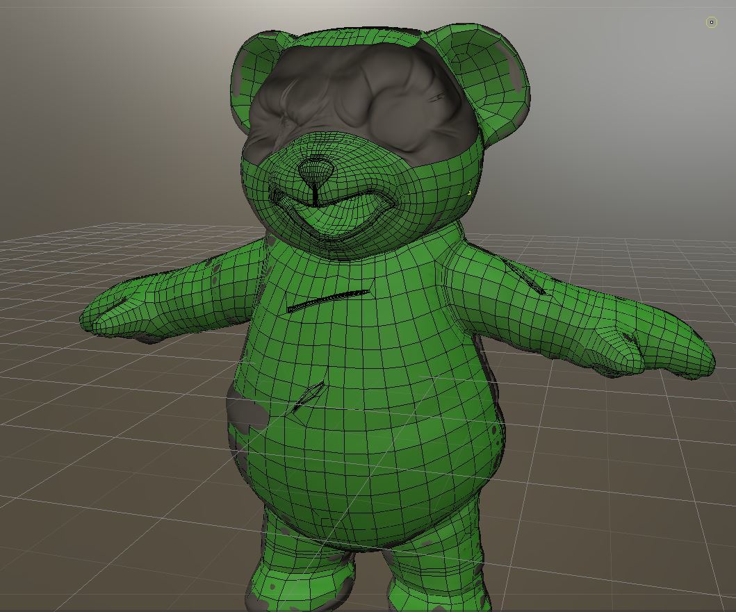
Thank you very much for the compliment. I'm doing retopology as this bear was made with dynamesh and I'm really liking it so want to use this as a portfolio asset and do a cool little scene and render and texture in vray so want a tidy mesh to bake the sculpt details into and to take into substance painter for textures.

Looking good bro !
Nice bake!
Thanks Rath  theres some parts that i'll have to paint over as the the side seams of the teddy got a bit mesy... Ughhhh man i am swqampped with art work at the moment and one of my clients is bit of a time sink only been ablwe to chip away at this. really missing the 3 weeks of christmas time where no one needed anything lol.
I Will finish this as a personal challenge.
here's where my low poly mesh are at now. to try and save some time i am retoping som meshes together that should be seperate and then use a material id to seperate them for texturing.

Oh god haha, I can't wait to see the render for this, love when a bit of humor is mixed in xD
Very nice clean retopology! Aye, it is difficult with other responsibilities. I'm also taking this contest as an opportunity to better myself.
Look forward to seeing your texture passes, if hand painted I can picture him as a Riot/Blizzard style character!
hey thanks Rath, been really hard getting things done, been baking maps while ive been slaving away concepting characters. only now just chucked them into marmoset for test renders and its heartbreaking that they look pretty bad theirs a lot of issues... might have to paint over what xnormals have produced

adding A O maps help Hide some glaring normal map seams and stuff butttttt i dont wanna hide behind AO.... still got some weird stuff under the bears nose
Your Teddy turned out way better than I thought in the first place.
If you would not point out the error I would have not seen them, I think I would fix some in photoshop, but I am a newbie with baking? And if you can manage a better bake would be great.
Hey Alien I noticed that you needed some help baking out the maps in Xnormal. I looked at the image above and maybe you could do somethings to fix those issues. The weird hard line could be vertices that haven't been welded together. The nasty artifacts can be fixed by expanding the cage out a little more in that area (sometimes that gives you more artifacts because the geometry is so close together) . The rim around the button can be fixed by adding more geometry and you'll get rid of the jagged look to it around the edge. The low res detail can be corrected but scaling up the UVs in that area or fixing the UVs all together. Remember that theres no limit to geometry or textures in this contest so you could probably create different texture sets to make it look even better. I cant really see whats going on in the lower image there. I tend to over work on my normal map and fix it as much as possible so I dont have issues with the other maps I need to bake out. I hope that helps you a bit. Post up more issues if you'd like more help on this.
Thank you so much for your advice Nico, I greatly appreciate it dude ill admit i have cut some corners in particular with the belt having multiple bits of geo for a texture set in an attempt to save me some time as i think it maybe a push for me to get this finished on time. but it seems to have caused me a lot of issues instead hahahaha.
Yeah it happens... but sometimes spending a bit more time on somthing on these things assures you zero issues later on. Its good to catch them in time though. Hope you're able to correct these issues so your character looks amazing 
It may be helpful to bake out some of the chunkier bits directly in zbrush with projection. It gives the most seamless bakes I find for certain organic pieces.
Love how the character is developing!
Hey alien head, why to I end up making freinds with the wierd people, anyways looks good. Did you watch any of the ZBrush summit stuff. And your teddy look so much more agressive then on the skecth - its for the better, I never saw a happy gladiator