• Gave myself 5 days to do something. This is what I managed to do. I'm trying to get better at illustrations, but I have patience to work on something for 3 days maximum :( Splash_Process.jpg5000x3140 2.21 MB Splash_Process-6.jpg3896x2429 2.83 MB concept list char copy.jpg5388x3000 1.7 MB
    20.5k
  • Did a character concept for a course.https://www.artstation.com/artwork/P6gm3y - more:) list1.jpg3541x1920 2.82 MB
    20.5k
  • Day 4: Star Wars May The 4th =] Queen Padmé Amidala in my art style! First time drawing her and I really enjoyed making this one! Used watercolours, ink pen, acrylic markers and gold paint for accents on my Canson mix media sketchbook. I hope you like it!
    81.2k
  • A creature design from a while back
    by
    6.6k
  • Here is some more recent stuff, I need to make more body studies
  • It's been a while and god, it is so cringe to go through all previous messages xDmy study.
    20.5k
  • Thank you! I finally cleaned that up. Meanwhile started 3 more ..I have a habit of taking too long to finish a piece, then I lose interest in it and just start something else. I found 8 from recently i started and abandoned, that are decent enough to not delete, but not finished. There’s also been a number of drawings I felt I “outgrew” - became better before I finished them, and it would be easier to start from scratch than fix them. Anyone else thinking that?
  • Lady Death Fanart Collectible: Part 6 Polypaint and base Hi, it’s time to share with you another part of the process to create this fanart piece. Polypaint As this is my first collectible fanart I didn’t have previous experience with polypaint so I tried my best and played a bit with it.I wanted to give a ghostly and eerie look to Lady Death, she is beautiful and deadly, but at the end of the day she is a woman that died and was reborn at hell as an avenging spirit, that’s why I gave her skin tone a bluish very cold tone.As you will see I gave myself some creative freedom to deviate from the traditional color scheme that this characater has in comics and illustrations.To add a bit of sensuality by painting some freckles on the face and the chest. The dark nature of this character was the perfect excuse to gave her a kind of goth make up, very dark shadows around the eyes, blue lips and fingernails. I know that the original character includes sexy red lips but I wanted this girl to have a sexy but at the same time creepy look, that’s why we can see some thin veins emanating from her eyes. The biggest chromatic change I did for this character is at the hair. Lady Death has a characteristic white weavy hair but in my fanart I decided to gave her a very saturated blue color.The reason behind this wasn’t only an aesthetic choice. I want that the face area strongly pulls the attention of the viewer so this area needed a stronger contrast. Another reason is that I want her to have a more modern look, as I mentioned before, I’m strongly attracted to women with goth/punk look. I gave myself half an hour or more to analyse the work of experienced sculptors that create collectibles and I discovered that the use of darker values on the skin is often applied to create a greater sense of volume and three-dimensionality. I found that areas with heavy ambient occlusion are the perfect places to paint with darker colors in order to increase the separation between different forms. Even though she has a bluish skin tone, I used a bit of warmer hues in areas that, in real life, tend to go towards red and pink, this is very obvious in the nose, cheeks, and knuckles. Thinking with a logical mind it’s completely absurd to have warmer tones on the body of a zombie like creature but I didn’t want to limit myself by using only blue tones, it looks boring and artificial. In real life these colors are created by blood vessels in areas where the skin is very thin. ** Scythe **for her weapon I applied a cool gray with some warmer variations, this color scheme is influenced by the work of H.R giger. Base I’d like to talk about the design for the base which, to be honest, I forgot to develop along with the character.My main idea with the base is to show that Lady Death inhabits a very sterile and arid land, at the end of the day she is at hell.You can see a that she walks over dirt and rocks, a sign that she’s surrounded by death and loneliness. As part of the landscape we can see some bones and skulls to reinforce the idea of lack of living creatures, yet we can see three hands that try to reach her legs.This hands represent that all creatures are subordinated to her power and seek an evil blessing with a simple touch of the princess of the damned.1- The hand with skin burns represents the souls of those who are newcomers to hell, tortured souls that suffer for the sins comitted on earth.2- The hand with greenish rotten skin and pustules is the reminder of the decay that has infected the souls of those who have been trapped and have forgotten their humanity3- Last but not least, the hand of a demon shows that even dark creatures and entities bow before her presence. The cherry on the top, at least in my vision, are the simese twins that emerge from the ground, this malevolent creatures remind us that in hell there’s only perversion and any trace of innocence is lost. Thanks for reading till this pointI’m really happy to be very close to finish this creative journey, last but not least it’s mandatory to talk about splitting the sculpture in several pieces to be printed, this will be my last entry before showing the final rendered images. See yaMay Zbrush be with you
    1.4k
  • memory 2min gartic phone, used ref 2m gartic, used ref for pose 2min gartic 2min gartic 2min gartic 2min gartic memory memory memory memory study memory memory memorymemory memory memory memory memory memory study memorystudy study stylized left memory, right study study memory memorymemory memory memory memorymemory memory, porportions r offmemory memorystudystudy memorymemorymemory memory memory memory memory memory memory memory, right leg is a bit broken The feeling of only getting 1 - 3 likes on a social media post will never not be discouraging. But nothing is discouraging enough to make me quit drawing. I think the strategy of drawing a lot of stuff and waiting a while to post is good though rather than posting it immediately and then feeling that sadness on the next set of drawing
  • Urban Dragon Girl Wip Urban Dragon Girl_wip1.jpg5000x5000 1.11 MB
  • Long time no see! New artworks produced lately
    6.5k
  • studies studies juri study imagination, how I feel before a speech imagination imagination study something I drew for my presentation also drew this for my presentation, didn't fix the one hand being bigger than the other imagination + study study studies study study, I need to fix the face a bit based on screenshot from anime but in my style study. except for the eye study studies studies study. changed some things tho imagination imagination imagination study studies, except top right samurai based on anime screenshot wolverine studies, changed some of the poses a lil, not very good at all, but first time i drew the character ever. semi study studies study imagination imagination imagination , for first time ever i tried to draw over 3d model for middle pose, I dont like the result tbh, but it makes it much easier than coming up with it from memory.imagination, except right figurestudies imagination + studies, coming up with action poses r hard, these are not dynamic enough, I will redraw better ones in future. imagination , imagination imagination study, except for eye imagination imagination imagination doodles except for the two chrollos imagination storyboard thumbnail, idk if i ever shared this. my storyboards end up being a little detailed since i usually just draw in one layer.
    by
    21.9k
  • Quick fun sketch. CyberFish.jpg2394x3857 674 KB
  • Neon Gambit This is a fan art of my all time favorite character Gambit from the X-Men.I made this a birthday gift (26.04.2024) to myself and honestly I really do like how it turned out in the end =] I hope you like it as well =]
    81.2k
  • Art Blog - April to September 2023 Suffer a little burn out. Look at some memes. Here's some art from in between. critique.jpg1333x5736 1.77 MB
    20.2k
  • And some more! Been painting over them a bit more this time. Some variants I tried for the old guy using mainly the liquify tool. Someohow looking a bit like Owen Wilson (not intended :D)
  • Cafe sketch/color study
  • Hello! My name is Vithor, I am from Brazil, studied Design at a local college worked as an illustrator for more than 10 years. I took a time off around 3 years ago and am trying to get back in my art shape and maybe become professional again. Here are some recent pictures: You can find timelapses for most of them on my instagram: www.instagram.com Vithor Albertim (@vithor_albertim) • Instagram photos and videos 123 Followers, 638 Following, 19 Posts - See Instagram photos and videos from Vithor Albertim (@vithor_albertim) Comments and critiques are always welcome.Cheers!
  • @patrycja.lerch Thank you I created another variant, which might capture the witch look I was going for better
  • Thank you @daceronine! If I remember I save in google cloud, I will have to stick a note to do it more often. Lamp is from life. Poses are from refs but I look at refs for a while and then try to do it myself and look it up if needed. Outfits and rest is from imagination Something went wrong while installing system so we will have to wipe everything again... pc works but something is wrong. We will wait till internet is done and I will save everything on cloud this time Threads came out in eu. It's been 3 days and I had more engagement than after half a year on instagram. It feels really nice I hope it stays this way A portrait of old dude. It's the same character I posted a while ago. Inspired by Bayard Wu work. At first I thought of him as a bear but I named him Fenrir and I think wolf suits him better. Eye gave me a bit of hard time but I think it is fine now. I focused on face and forgot about area below. The way I draw hair clashes with greying hair. I had the same problem while doing Lohse's white hair. Does it looks like it is greying here? I love how desaturated red looks blue there. I keep lying to myself that I will use different color scheme but It all comes down to this blue and yellowish one it is just flipped this time Have a great day!
  • Been bad about posting updates on the forum. I figure I should just throw down stuff. instead of waiting until I finish something.
    14.4k
  • Havent done much this year since I am focusing on learning programming and deving my own Indie Game . But here 's a New Year Piece 2024 , she 's the mascot for my Game Studio - Lucid Realm : Lucid Chan ! LucidChan_v001_sketches.jpg3072x4352 973 KB
  • IMG_0637.jpeg3240x4050 1.6 MB
  • Long Crested Eagle studyI had so much fun making this one and honestly I love that Eagle! It looks so cool! Used for this one high quality watercolours, high quality watercolour sketchbook/ cold press and it was 300 grams paper.I hope you like it!
    81.2k

Hello. My name is Jus I come from Slovenia and I am currently employed as a front-end developer and graphics designer, but before that I was a freelance 3D artist. I am also finishing my masters in computer science. I wanted to study Animation but there are no animation schools in our country and my family couldn't afford to send me abroad and at the time, my main interest was 3D so I went to a computer science university. My focus changed to 2D over time, but haven't found the time pursue it. But I hope to do so now :smile:.

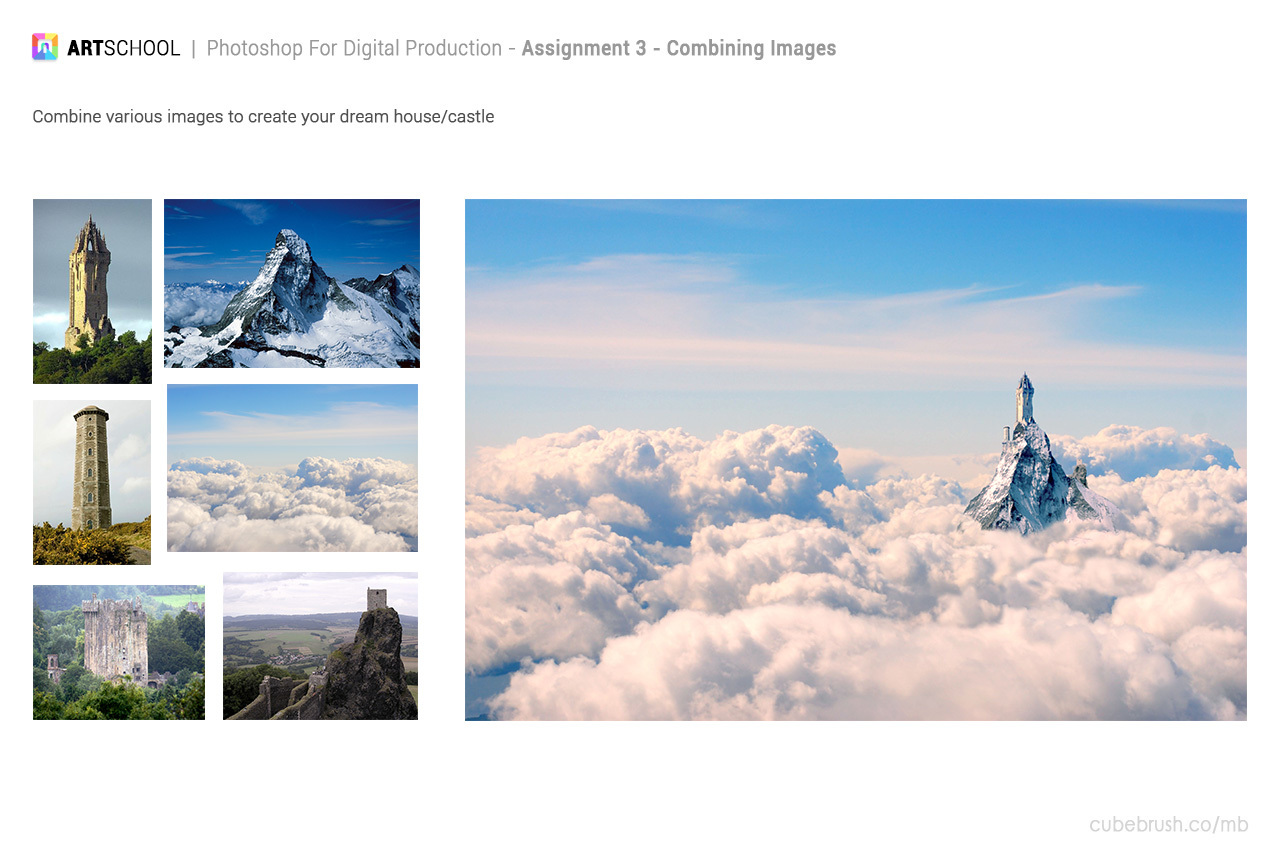
I will use this topic to submit my solutions of assignments. I am looking forward to your feedback and critique. I hope we will be able to improve together. :smile:

What did you use to get those straight lines?

I did them by hand. But my digitizer may be a bit low res so the lines didn't move much.

Maybe a tip would be to look more where you want the line to go not where the line currently is. At least that's how I normally do it.

I also like to rotate the image in a comfortable position so its easier to make a clean stroke.

You can rotate the image in photoshop when holding the "R" key.

I didn't think of that! And I had used that function before XD Thanks, that's awesome :smile:

ASSIGNMENT 3:

This assignment was pretty fun. I liked seeing what everyone came up with. So this is mine and I would love to hear your feedback.

Nice, I like the castle, a simple composition easily conveying the concept. and the colors all appear right to the eye.

And yeah, does just look like the digitizer has a really low resolution, but I would argue that getting that instant feedback of seeing the pixel jump might even be useful!

I think I am gonna redo the exercise zoomed in a bit more or maybe just print out the assignment sheet.

I agree that a bunch came out really good.

I would thing about putting a little more weight to the legs in the later images, I am having a hard time telling if the proportions are right, but they are looking small compaed with the reference photos.

Otherwise good stuff. Any progress with the pen digitizer situation?

@peter-hartnett I did the 1. part of the exercise this time zoomed in a bit. And I think the result is a bit more indicative:

This time I was also trying to do more of a stroke motion, while the first time I kind of slowly moved from one point to the other. I also noticed that sometimes I didn't press the stylus perpendicularly to the screen, which caused my stroke to stray in the start. Instead of this exercise I was doing cylinders in perspective in my sketchbook, but I really should do them on the display tablet just to get more of a feel for drawing on it.

Btw I use the Ugee 2150 pen display. The display is fine and until now I never felt that the resolution was lacking. I does however have some driver issues with some programs (krita version 3+).
If I were buying a display now (and didn't have the money for a cintiq :smile: ), I would buy the Huion GT-221 Pro. I haven't heard anything bad about the display and the drivers look great. The allow to set any macro to the express buttons even running batch programs. It even has a drag bar.

Yea you're right I also thought it's hard to see the proportions. I was thinking of placing the reference and figure side to side and to the trace on the figure just to compare.

Good start, i like you sky castle concept really nice cloud image. Getting good images and images that feel like they can work together is like 80% of the battle i think.

Keep working on your 3d volumes and structure and I really recommend studying the pose analysis like in Marcs videos, line of action , joints, boxes etc.

Try to make clean lines and be loose with your arm, don't use too much wrist. I think you are starting to get that with what you said in your last post. keep it up.

Thanks for the feedback @introspection_ . I really need to do the cylinder exercise, because I don't think before I actually do the line, it will also help me with circles. In the following image I tried to be more deliberate when making strokes.
Did the figures also on the actual references:

All the little mistakes become really apparent when you put the images side-by-side. I need to pay more attention to the distance between the pelvis and the ribcage, and their individual poses. But generally I think the results aren't too bad.

Now I will concentrate on improving my line. I feel like it's going to bite me in the :peach: later if I don't work on it now.

@jlozej That castle assignment is gorgeous, looking amazing! I see your figures are improving as well. Good to do both the figures on the models and copy it seperately.. Great way to check your own version of it! As per feedback I'd say just keep doing these and practice with getting that dexterity with your pencil! Good luck =)

Good stuff, jlozej. And I have heard pretty good things about the huion products as well. Appears that wacom is finally getting some real competition!

9 days later

A figure drawing i did for assignment 7:

I messed up the positioning of the of the pelvis relative to the body. It should have been placed somewhere below the head.

I also used this exercise to do a value study. One mistake that I did is that I used a brush that blends which caused me to lose site of the values I was using. Will definitely redo this exercise, with a prepared palette of values.

In the meanwhile I have been doing the gesture drawing exercies. They are pretty hard, but I think it is a very valuable exercise. It forces me to think before making a line.

@jlozej I like your latest drawing. Its a tough exercise and doing it often is going to benefit your observational skills so much. I like how you reflect on your own work and see the benefits of practicing it. I'm also struggling with this assignment, but gotta keep working ey =) Keep it up, love to see more of your work!