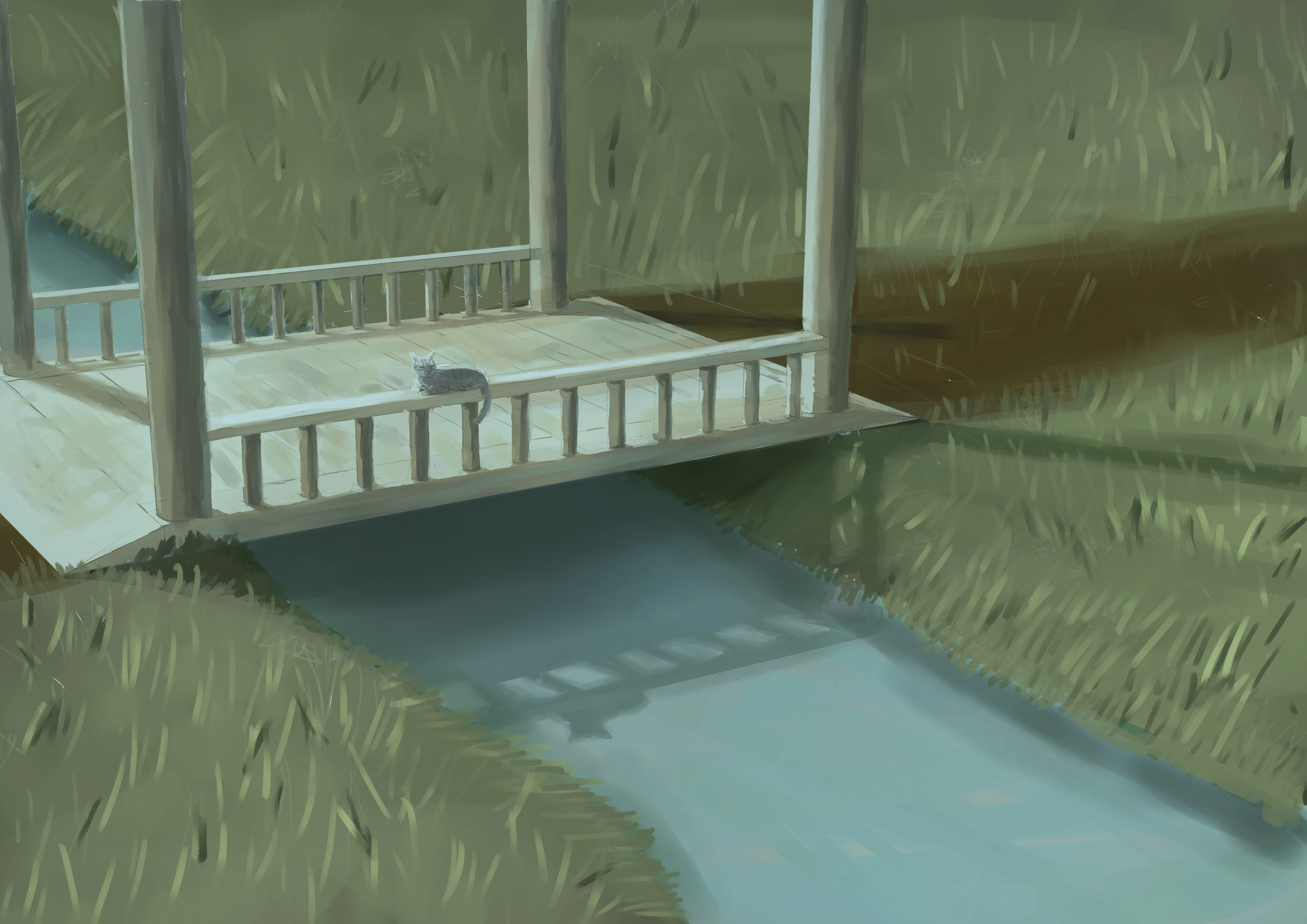
I finally finished my illustration. I think I took it as far as I can go. It was nice to try out different things with the coloring, rain effects, etc. But I think it's time to move on. I think I need to keep pushing myself in terms of composition.

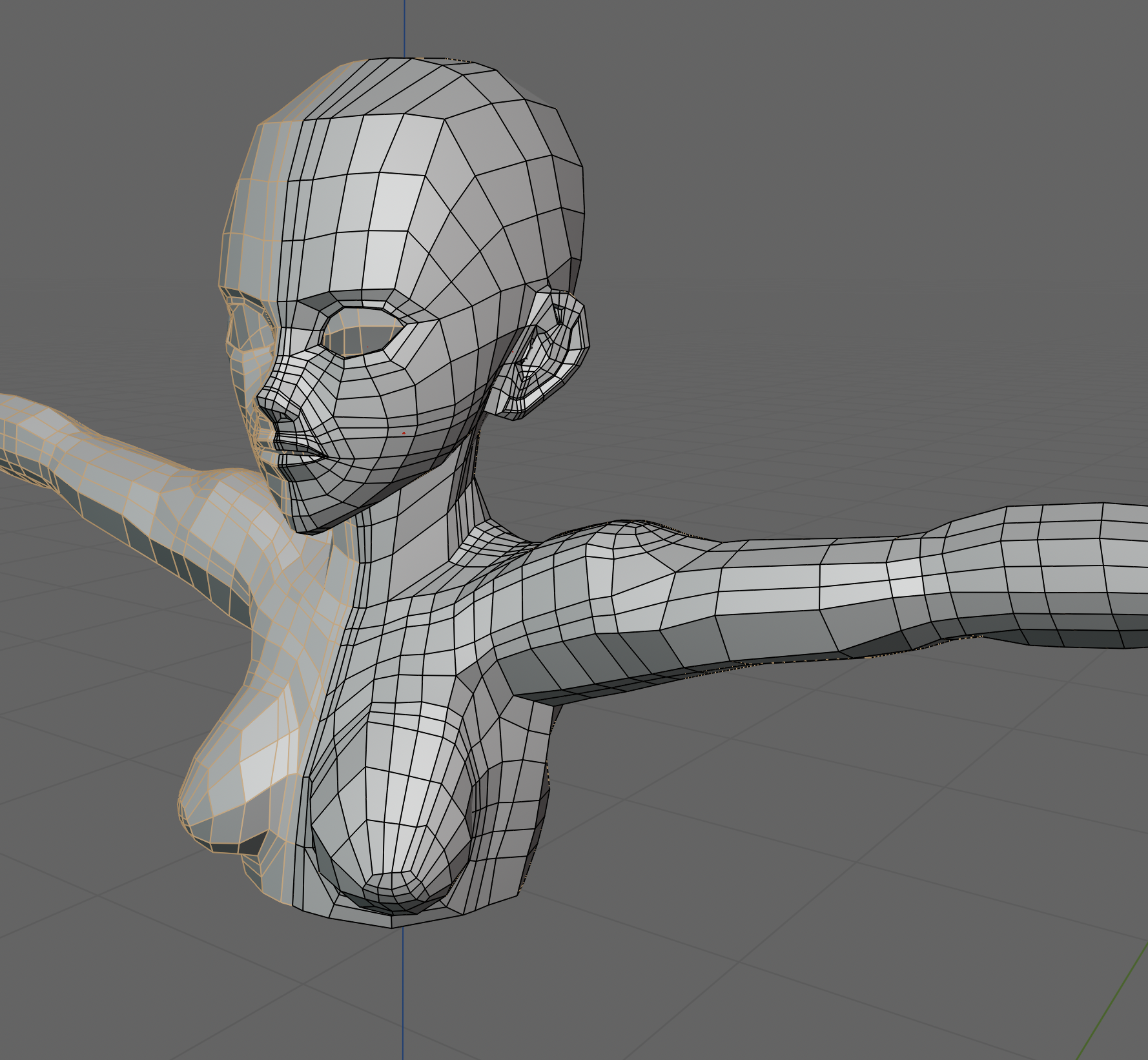
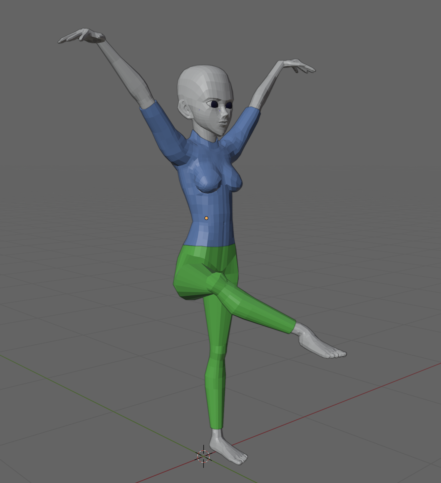
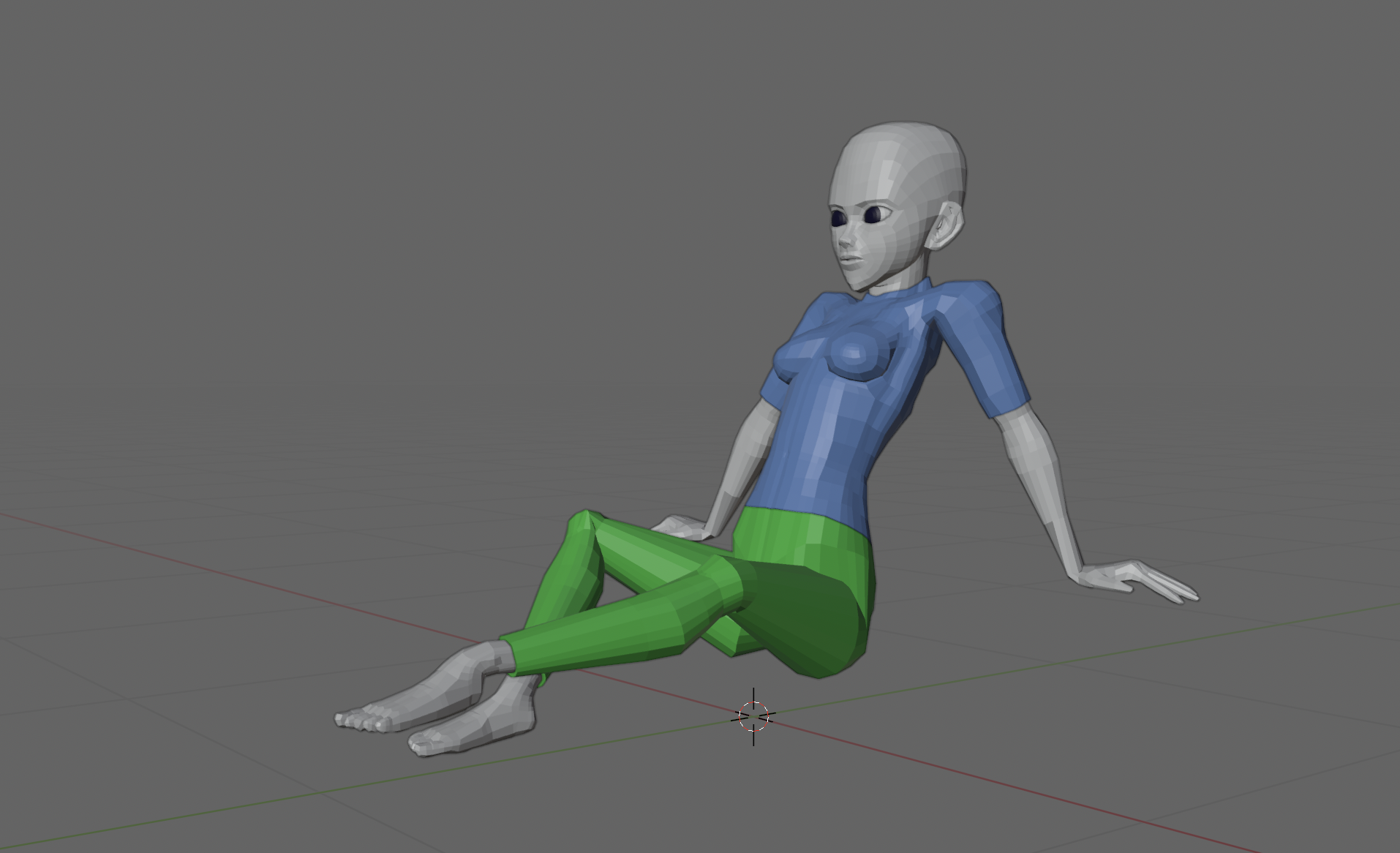
Also, I'm finally getting back into retopolgy. It's a bit confusing, since I'm referring to the tutorial again, but my model is different from the YouTuber's, eo I have to keep mind how my retopology might be a bit different than his.