


Thank you , I truly appciacte the feedback and replies. Im a bit shy when comes to the internet i'm glad this community is so helpful and encouraging.

 Thank you! I finally cleaned that up. Meanwhile started 3 more ..I have a habit of taking too long to finish a piece, then I lose interest in it and just start something else. I found 8 from recently i started and abandoned, that are decent enough to not delete, but not finished. There’s also been a number of drawings I felt I “outgrew” - became better before I finished them, and it would be easier to start from scratch than fix them. Anyone else thinking that?in24.0k
 Lady Death Fanart Collectible: Part 6 Polypaint and base Hi, it’s time to share with you another part of the process to create this fanart piece. Polypaint As this is my first collectible fanart I didn’t have previous experience with polypaint so I tried my best and played a bit with it.I wanted to give a ghostly and eerie look to Lady Death, she is beautiful and deadly, but at the end of the day she is a woman that died and was reborn at hell as an avenging spirit, that’s why I gave her skin tone a bluish very cold tone.As you will see I gave myself some creative freedom to deviate from the traditional color scheme that this characater has in comics and illustrations.To add a bit of sensuality by painting some freckles on the face and the chest. The dark nature of this character was the perfect excuse to gave her a kind of goth make up, very dark shadows around the eyes, blue lips and fingernails. I know that the original character includes sexy red lips but I wanted this girl to have a sexy but at the same time creepy look, that’s why we can see some thin veins emanating from her eyes. The biggest chromatic change I did for this character is at the hair. Lady Death has a characteristic white weavy hair but in my fanart I decided to gave her a very saturated blue color.The reason behind this wasn’t only an aesthetic choice. I want that the face area strongly pulls the attention of the viewer so this area needed a stronger contrast. Another reason is that I want her to have a more modern look, as I mentioned before, I’m strongly attracted to women with goth/punk look. I gave myself half an hour or more to analyse the work of experienced sculptors that create collectibles and I discovered that the use of darker values on the skin is often applied to create a greater sense of volume and three-dimensionality. I found that areas with heavy ambient occlusion are the perfect places to paint with darker colors in order to increase the separation between different forms. Even though she has a bluish skin tone, I used a bit of warmer hues in areas that, in real life, tend to go towards red and pink, this is very obvious in the nose, cheeks, and knuckles. Thinking with a logical mind it’s completely absurd to have warmer tones on the body of a zombie like creature but I didn’t want to limit myself by using only blue tones, it looks boring and artificial. In real life these colors are created by blood vessels in areas where the skin is very thin. ** Scythe **for her weapon I applied a cool gray with some warmer variations, this color scheme is influenced by the work of H.R giger. Base I’d like to talk about the design for the base which, to be honest, I forgot to develop along with the character.My main idea with the base is to show that Lady Death inhabits a very sterile and arid land, at the end of the day she is at hell.You can see a that she walks over dirt and rocks, a sign that she’s surrounded by death and loneliness. As part of the landscape we can see some bones and skulls to reinforce the idea of lack of living creatures, yet we can see three hands that try to reach her legs.This hands represent that all creatures are subordinated to her power and seek an evil blessing with a simple touch of the princess of the damned.1- The hand with skin burns represents the souls of those who are newcomers to hell, tortured souls that suffer for the sins comitted on earth.2- The hand with greenish rotten skin and pustules is the reminder of the decay that has infected the souls of those who have been trapped and have forgotten their humanity3- Last but not least, the hand of a demon shows that even dark creatures and entities bow before her presence. The cherry on the top, at least in my vision, are the simese twins that emerge from the ground, this malevolent creatures remind us that in hell there’s only perversion and any trace of innocence is lost. Thanks for reading till this pointI’m really happy to be very close to finish this creative journey, last but not least it’s mandatory to talk about splitting the sculpture in several pieces to be printed, this will be my last entry before showing the final rendered images. See yaMay Zbrush be with youin1.4k

 memory 2min gartic phone, used ref 2m gartic, used ref for pose 2min gartic 2min gartic 2min gartic 2min gartic memory memory memory memory study memory memory memorymemory memory memory memory memory memory study memorystudy study stylized left memory, right study study memory memorymemory memory memory memorymemory memory, porportions r offmemory memorystudystudy memorymemorymemory memory memory memory memory memory memory memory, right leg is a bit broken The feeling of only getting 1 - 3 likes on a social media post will never not be discouraging. But nothing is discouraging enough to make me quit drawing. I think the strategy of drawing a lot of stuff and waiting a while to post is good though rather than posting it immediately and then feeling that sadness on the next set of drawingin

 studies studies juri study imagination, how I feel before a speech imagination imagination study something I drew for my presentation also drew this for my presentation, didn't fix the one hand being bigger than the other imagination + study study studies study study, I need to fix the face a bit based on screenshot from anime but in my style study. except for the eye study studies studies study. changed some things tho imagination imagination imagination study studies, except top right samurai based on anime screenshot wolverine studies, changed some of the poses a lil, not very good at all, but first time i drew the character ever. semi study studies study imagination imagination imagination , for first time ever i tried to draw over 3d model for middle pose, I dont like the result tbh, but it makes it much easier than coming up with it from memory.imagination, except right figurestudies imagination + studies, coming up with action poses r hard, these are not dynamic enough, I will redraw better ones in future. imagination , imagination imagination study, except for eye imagination imagination imagination doodles except for the two chrollos imagination storyboard thumbnail, idk if i ever shared this. my storyboards end up being a little detailed since i usually just draw in one layer.in21.9k

 Hello! My name is Vithor, I am from Brazil, studied Design at a local college worked as an illustrator for more than 10 years. I took a time off around 3 years ago and am trying to get back in my art shape and maybe become professional again. Here are some recent pictures: You can find timelapses for most of them on my instagram: www.instagram.com Vithor Albertim (@vithor_albertim) • Instagram photos and videos 123 Followers, 638 Following, 19 Posts - See Instagram photos and videos from Vithor Albertim (@vithor_albertim) Comments and critiques are always welcome.Cheers!in784

 Thank you @daceronine! If I remember I save in google cloud, I will have to stick a note to do it more often. Lamp is from life. Poses are from refs but I look at refs for a while and then try to do it myself and look it up if needed. Outfits and rest is from imagination Something went wrong while installing system so we will have to wipe everything again... pc works but something is wrong. We will wait till internet is done and I will save everything on cloud this time Threads came out in eu. It's been 3 days and I had more engagement than after half a year on instagram. It feels really nice I hope it stays this way A portrait of old dude. It's the same character I posted a while ago. Inspired by Bayard Wu work. At first I thought of him as a bear but I named him Fenrir and I think wolf suits him better. Eye gave me a bit of hard time but I think it is fine now. I focused on face and forgot about area below. The way I draw hair clashes with greying hair. I had the same problem while doing Lohse's white hair. Does it looks like it is greying here? I love how desaturated red looks blue there. I keep lying to myself that I will use different color scheme but It all comes down to this blue and yellowish one it is just flipped this time Have a great day!in47.3k
8 months later
Hello Art school community, apologies for the prolonged hiatus. A lot of moving , traveling and replacing pc equipment this from said moving and traveling. So long story short , Life keeps you busy  My last post was back in May and I CAN'T BELIEVE how fast time has flew by.
One of my things that broke was my pen display so this exercise was nice chance for giving my new one a test run. Honestly, the circles gave me alot of trouble might have to practice with this more often to get used to my screen.
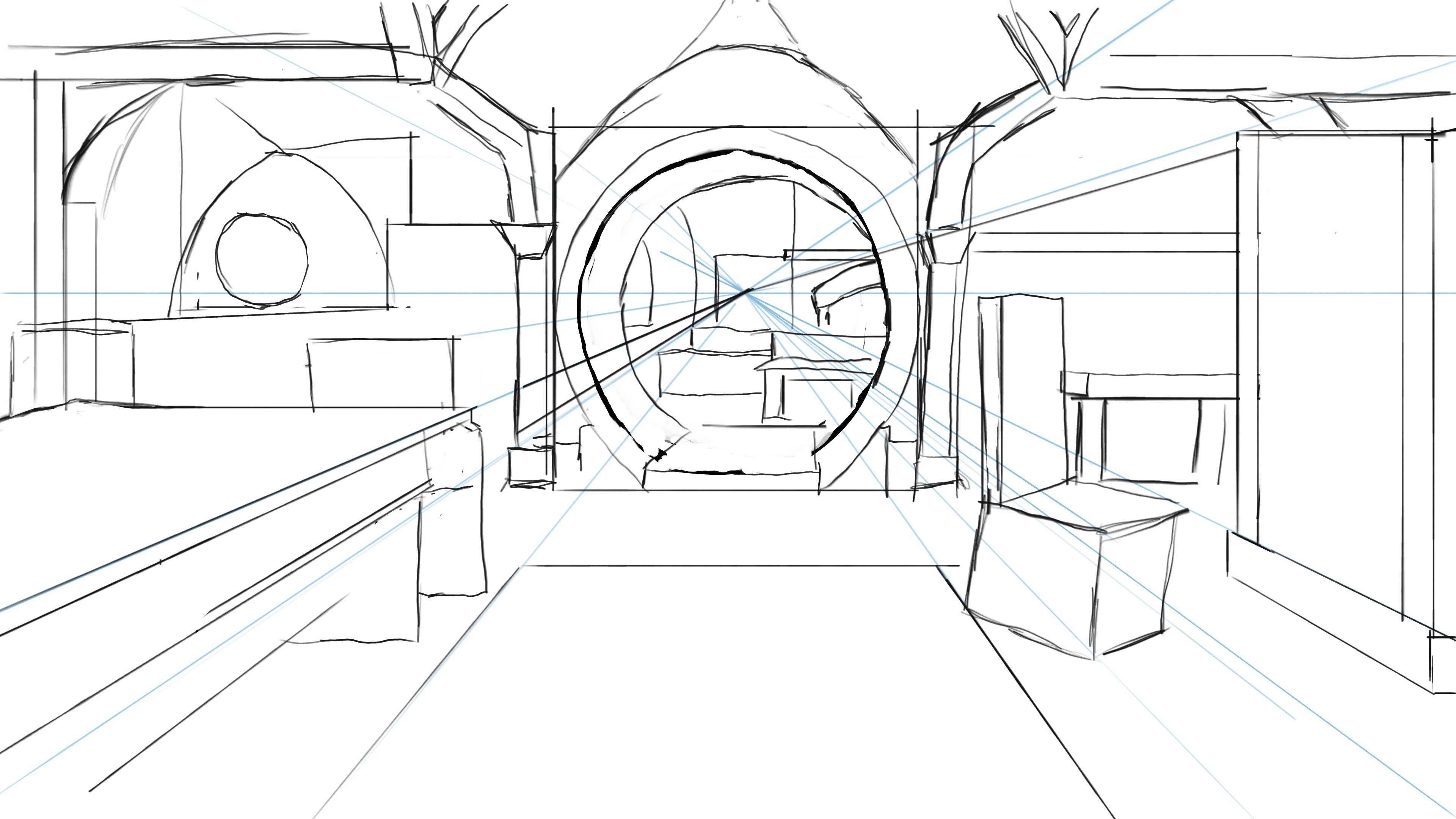
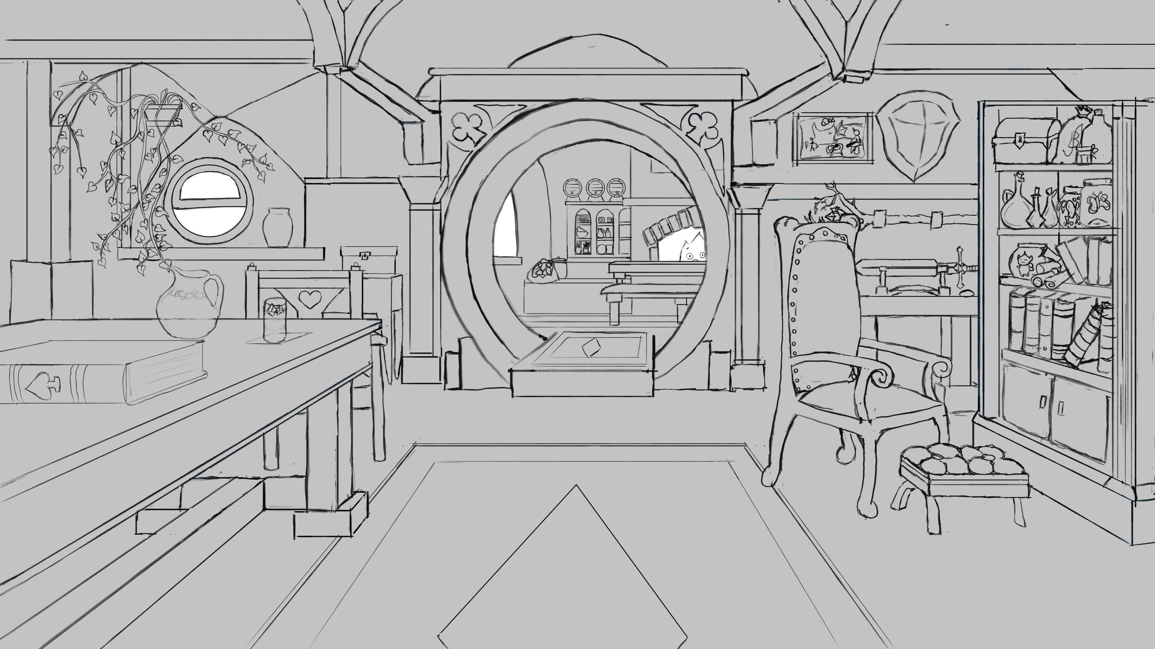
This next one is my one point perspective assignment. I used the doorway for dining room to my kitchen because I thought it had a good angle for depth past the horizon line to make the peice more interesting. I made it a fantasy hobbit hole inspired retired adventurer look. I meant to take more picture of the process of drawing just to be seen but I kinda got lost in drawing it.
Outline and planning
Finished Draft
These next few images are just a few things I've been working on recently that'd id like to share. I've been absent for the forums but I've been trying to keep a regular flow of projects and sketches on my own time.
This is a piece that I've started but stopped working on about 2 weeks back. I might come back to it but I think I might start it over. I love the color and the textures of the main subjects but there's something about the their positioning and the size of the overall peice im unhappy with. I feel I'm too far in to change those things now and might go back to try at it again.
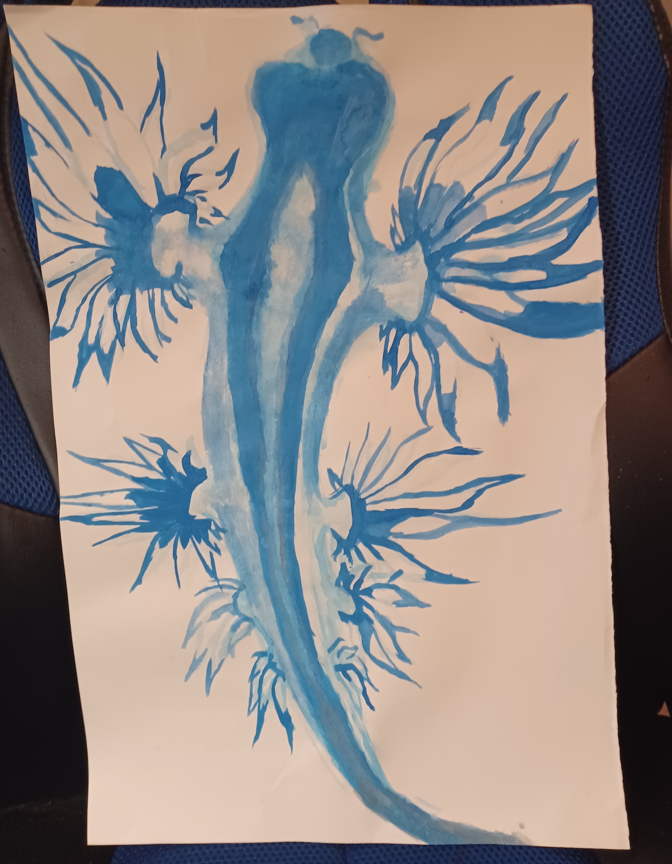
This is a water color painting of a Dragon slug I started. Water color is a medium I'm not too familiar with using myself but i have always appreciated its aesthetic and how other artist use it to its fullest . It captures subtlety and depth of color so much differently than other mediums I use ,so I decide to try and learn. I it is quite a process  I feel like a cave man painting with it because I'm so heavy handed and I'm used to added white not just using the color of the canvas. Ive been reading a book about and watching some videos but if anyone has any advice, I'm all ears.
My next post will be sooner than last  and i'll be diving into term 2.
Also I Just wanted to mention it since i dont reply to post often. Its been cool signing in every once in awhile these last couple months and seeing others progess in honing thier and all the new commers to the community. Helps keep me motivated.
Just wanted to say to whoever reads this keep going and keep doing your best.
Welcome back to the forums!, Don't let past events put you down, Life drives us all in the gutter at times, glad to see you're back though and so far you're doing really good, I love that 1 point perspective assignment, so many intricate details, keep it up!.
1 month later
Hello forum community , back again with another post. I'm neck deep into term 2 and have watched everything except the perspective 2 video. I've been taking my time diving and studying different head anatomy , shading techniques as well the usual sketching and gesture.
Unfortunatly I've spent a lot of time away from my desk this last couple of weeks ,so all i have to share is some of my sketchbook. Practically filled a sketch book with random bodies and shapes.
Here are a few random pages tho


I dont plan to be on the move again anytime soon and have a better working schedule than before. I'll have some digital sketches and assignment to share next time I post. I've had a lot more time to myself during the day as well and have made it my personally goal to post at least roughly once a week.
till next time
13 days later
Hello everyone ! Back again with some drawings, I've been able to work on my pen display on and off for about an hour to 2 hours a day for the last week and a half. I feel I have improved on my line quality and accuracy but not on my speed. I just kinda get lost in the details when I draw from reference, just a habit I feel I need to be aware of.


Honestly, these heads took me the longest time, mostly because its hard for me to assemble the facial features together with correct proportions. In which case I'd start them over the next day. The Middle Face was my first attempt, I tired from imagination. I kept it on the canvas to figure out my mistakes because it looked right, but..off. I used a custom brush I made i krita, and didnt like the values that it would give me, it would come out too dark. I gotta play around with the brush maker more.
So for lefty and righty, I stuck to some reliable mediums for me as well as used references. They look better, but I feel like I'm going to practice faces and features along with my daily gestures in my sketch book. I really want to nail facial features. I want to exaggerate, like the nose and eyes. My ears need help too 


Next post soon to come, probably more faces, and some 3-point perspective assignments.
Hi, do you mind if you can show the reference image for the left and right faces?
I believed that you may have incorrectly positioned the facial features as the the middle of the sphere represent the brow, not the eye. Thus, it may looks like the character looks so compressed. Just checking, thx.
Yo, looking good overall, what gordon says is exactly what I am noticing, feature placement is off. Rendering and detailing is looking good.
It definitely took me a few tries before getting these things right. Things that I feel help the most is measuring height and width first (essentially boxing in), locating the midline and tilt, finding the glabella “keystone”, and drawing the contour of the midline to get a good idea of the proportions of the the features. Sideways proportions is a little more intuition for me as I really don’t have a systematic approach for that, so once I get overall proportions I start to measure reference points to get those but knowing skull anatomy and finding orbits / cygomatic arches helps a lot
Cheers!
Keep Going!!
Sure thing, they are screenshot of random people i found on tiktok. They had very angular chins/cheek shape so i thought it'd be good practice for stucture.Thank you @snakker and @Gordon003 I'll keep those tips in mind as I practice.


12 days later
Hey, everyone
Got into the office today after being sick a couple days and decided to draw a figure from memory , to test all my knowledge for the human form. Came ok I think
Hello ,everyone
These are son gestures and drawings i did thoughout the day today.
I spent much of my time today making custom brushes to better represent what strokes i like. After watching the demo I also was messing with vanishing points to deform shapes to better wrap my head around 3 point perspective, so far so good.


Also did a quick face sketch, I been trying to simplify the stucture of the faces I practices even more as to 1. not get lost in the details and 2. help with facial structure.
Hello everyone ,first time on my tablet in a couple days had a bit of computer woes i needed to fix and my son's been sick do to the weather and pollen. Have some of my daily geatures to show as well as a very rough sketch of a city wall that took me much longer that I'd like admit to draw
Most of my time went to figuring out vector point positions and trying to visualize from the grid what I'm trying to draw. Kinda get lost in the visual noise even with the Krita assited line dirctional snap helping me to make shapes. I think for my next attempt I'm going to break down a photo referance to better understand what Im looking for.
Anyone whose has had any success with 3 point perspective any tips you could give ?


Nice work on the studies
Umm as for the 3 point perspective, I guess it’s more of a concept thing to wrap one’s head around as it can be a bit ambiguous or confusing at times. From what I have learned up to now I can say its a bunch of technical rules that apply to line and object placement in art that help sell the way humans perceive 3D space. Those rules will vary delending on various factors that change from scenario to scenario
For example, when looking straight ahead towards the horizon, if an object is placed in front of you such as what you drew last, that is tilted only to its side (rotated on the Y axis only) you would apply 2 point perspective. When applying the vanishing points, the closer you place them the more the geometry gets compressed at the middle like a wide angle camera lens and the farther appart you place the points, the more you simulate a telefoto lens with no deformation
If you tilt the object on the X axis, or if you start looking at an angle upwards or downwards, you would have to use 3 point perspective to indicate that in your drawing
So for your example, what you can do is make some front and side view schematics and then imagine placing yourself closer to the object and looking up, or being on top of the wall and looking down, then you will have to use the 3 point perspective rules
Dang that was a lot of text, hope it helps
Cheers!
Thanks for the assit, I'll keep working at it.
(and don't worry I dont mind alot of text)
Suggested Topics
| Topic | Category | Replies | Views | Activity |
|---|---|---|---|---|
| Apham - Art School Journey - Starting from Scratch | Art School | 40 | 7.1k | May '22 |
| Xybb (Sascha) - Art School Journey | Art School | 126 | 14.3k | Dec '22 |
| Sara - Art School Journey | Art School | 103 | 10.3k | Mar '23 |
| CYP2C19’s Art School Journey | Art School | 120 | 9.7k | Jan '23 |
| Vaggelis - Character art journey | Art School | 8 | 1.1k | Sep '22 |